Voted Best Answer
May 09, 2020 - 12:26 PM

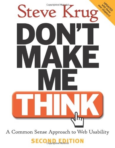
It requires ingenuity and genuine will rather than deep pockets. Here's a good example from the physical world (by Steve Krug in his classic Don't Make Me Think) that my inspire some ideas:
------
What designers and developers fear as they learn more about accessibility. More work: For developers, accessibility is just one more new thing to fit into an already impossible schedule. In the worst case, it gets handed down as an “initiative” from above, with time-consuming reports and reviews
Compromised design: What designers fear most is places where good design for people with disabilities and good design for everyone else are going to be in direct opposition.
They’re worried that they’re going to be forced to design sites that are less appealing—and less useful—for most of their audience. It conjures up an image like the Vonnegut short story where the government creates equality by handicapping everyone.
In an ideal world, accessibility would work like a sign I saw in the back of a Chicago taxi. At first it looked like an ordinary sign. But something about the way it caught the light made me take a closer look, and when I did, I realized that it was ingenious.
The sign was overlaid with a thin piece of Plexiglas, and the message was embossed in Braille on the Plexiglas. Ordinarily, both the print and the Braille would have been half as large so they could both fit on the sign, but with this design each audience got the best possible experience. Elegant.
---
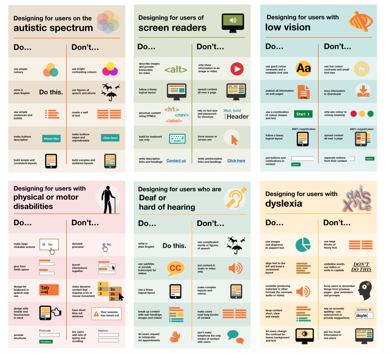
And here are more tips from Krug (on accessiblity). I highly recommend getting his book:
Fortunately, someone has done the heavy lifting for you. Mary Theofanos and Janice (Ginny) Redish watched 16 blind users using screen readers to do a number of tasks on a variety of sites and reported what they observed in an article titled “Guidelines for Accessible and Usable Web Sites: Observing Users Who Work with Screen Readers.”6 6 Published in the ACM magazine Interactions (November-December 2003). With permission from ACM, Ginny has made it available for personal use at redish.net/images/stories/PDF/InteractionsPaperAuthorsVer.pdf. Yes, it’s ten years old, but it’s still relevant.
After you’ve read Ginny and Mary’s article, you’re ready to spend a weekend reading a book about Web accessibility. These two are particularly good: A Web for Everyone: Designing Accessible User Experiences by Sarah Horton and Whitney Quesenbery. (Their approach: “Good UX equals good accessibility. Here’s how to do both.”) Web Accessibility: Web Standards and Regulatory Compliance by Jim Thatcher et al. (“Here are the laws and regulations, and we’ll help you understand how to meet them.”)


Add New Comment