Answers

Feb 26, 2019 - 02:05 PM
Here's a quick critique. Here's what I like:
- The clean look and feel of the site. It feels inviting and trustworthy.
- That you show the tools in use. It makes me feel like wanting to cook!
- You show a minimal amount of information and then ask visitors to browse based on category.
- You offer large discounts on some of the products
- The site is very well mobile optimized!
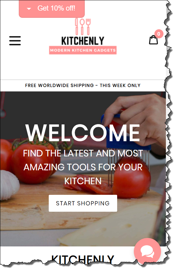
The main question I have is: Do you carry proprietary brands that I cannot get from Amazon or the major brick and mortar retailers? In other words, what is your core value proposition?
Is it lots of different brands all in one place at a higher discount than I could get elsewhere?
In our work on conversion rate optimization, the value proposition is the biggest lever you have in getting more people to buy from you. You can tweak other things (like headlines, calls to action, layout etc) and make some minimal gains but unless your value prop is clear and compelling, a new brand like yours will struggle to stand out.
And the two key elements in a compelling value proposition are:
1. Appeal (which you clearly have)
2. Uniqueness (I can't tell if you have this)
If you can find a sweet spot where these two intersect, you will do a lot better.
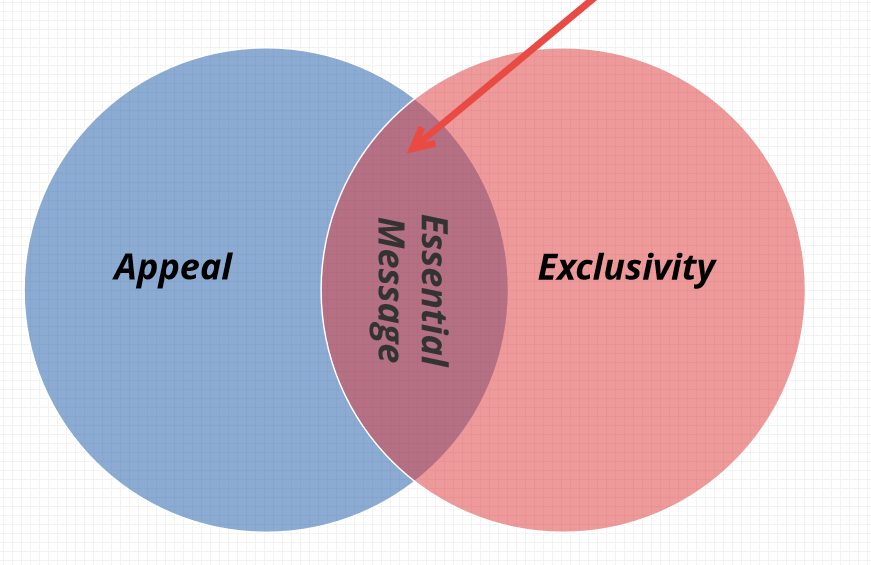
image credit: MECLABS.COM
It is easy to offer something that people want. The problem is many others are offering the same or similar things.
It is also easy to offer something unique. But chances are no one wants it. For example, I can create a burgundy, clay tik tuk (made up thing) with a black bandana! Totally unique, but has little appeal--unless you are my mother and I am a four year old :)
The real magic happens when you have and can clearly articulate elements of both.
Let's unpack what your headline is saying
"Find the Latest and Most Amazing Tools for Your Kitchen"
It does a lot of things right. The presence of an "--est" (as in Latest) is usually a sign of some kind of exclusivity as is "most amazing" (most-est :)) So you are definitely on the right track.
But is it believable? You are making unsupported claims and so you need "evidentials" to this to be true for the prospect. Anyone can say they have the "Most Amazing" kitchen tools.
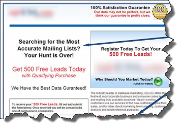
Here's an example from a case study published by MECLABS. A data company that compiles and sells contact information for businesses (and sells it to sales organizations). They had a headline that said:
"We Have The Best Data Guaranteed"
They then added the following pre-headline and also used more specificity in the headline. By the way, specificity sells.
We make 26 million calls every year to ensure you have...
"The Most Accurate Mailing Lists Available"
Here is the before
And here is the after
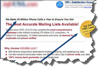
Which is more believable? Can you see the difference? Adding that pre-headline was one of the things that led to a 201% lift in lead submission on a form.
You too need to find ways to support your claims. It is usually best if others can do your bragging for you. i.e. find some kind of authoritative third party to endorse the claims you are now making directly. Think a JD Powers 9.6 rating for a given car model over the last 5 years. Or a 100 best places to work, last three years in a row. These things work!
Some Ideas for You
- Can you tell a good story about how you choose what kitchen tools to offer? You might get some ideas from the famous Schlitz beer ad written by Claude Hopkins (one of the pioneers of direct response marketing). He basically described a process that was standard in brewing to show why Schlitz beer was special and pure. This took Schlitz from 8th to 1st .
- Do you have a chef on staff who examines all the new kitchen tools being launched by various companies and goes through a rigorous process to choose just the most amazing ones? Just thinking out aloud here...(I am assuming you don't manufacture kitchen tools and so need to find some interesting angle to stand out)
Other things that could be improved on your page:
- Remove the large "Welcome" in the headline. It does not add any value and uses up valuable real estate. With the limited space on a mobile screen you could do a lot better.
- Avoid text overlayed on an image. Numerous heatmap studies show that this type of treatment is usually ignored because it looks like a banner ad. In fact (if you have enough traffic) I'd suggest doing a test yourself. Have an alternative version that has a plain black headline on white text and then use a tool like Mouseflow or Hotjar to generate a heatmap. You will likely see more attention drawn to the headline with the later version. If you don't have a lot of traffic, just take it from me that text overlayed on image causes 'banner blindness' (based on lots of studies!) and fix this. Use your traffic to test more substantial things.
Feb 27, 2019 - 06:37 AM
Wow! I'm amazed. Thank you so much for your feedback. It's without a doubt the best feedback i've gotten so far. If the other expert you've consulted answers please tell me.
Thanks!




Add New Comment