Money Mondays: 3 Ways This Landing Page Could Be Optimized to Generate More Sales
Today I'd like to share another landing page critique from our weekly series Money Mondays. Each week we send an email to our list with actionable tips that can be used to generate more ecommerce sales.
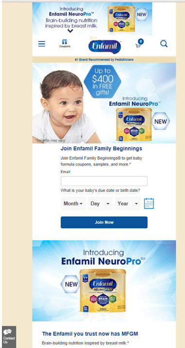
The page below is for Enfamil, one of the top selling baby formula brands. We do the critique from a CRO (Conversion Rate Optimization) perspective. While the tips are specific to this page, they illustrate general concepts that can be used to improve your own pages.
The Original Page (mobile version)

The Optimized Version
We always focus on mobile first because most traffic these days is mobile and most people treat mobile optimization as an afterthought, after designing for the desktop. It is a mistake to rely on your "responsiveness framework" to do the mobile optimization for you. Things usually end up look a little funny or out of place. To get the best results, you must design explicitly for mobile. This forces you to prioritize and choose elements that are best suited for mobile. You can then do the same for desktop and take advantage of the larger screen to use elements best suited for that form factor. First, before you scroll down, how would you improve this page. Don't cheat, and look. Try and figure out what you would do. If you are a new parent, you can likely do a better job than most.
Here are our initial thoughts: 1.Too many competing calls to action (we recommend having a single, large, clear one) 2. Too many elements in the first screen full. It almost looks like lots of banner ads! This causes friction. A confused mind says n 3. Redundant elements 4.MFGM – not everyone knows what this is but everyone gets “brain building nutrition”. Why not lead with this? 5. Make #1 pediatrician recommended more prominent (using doctor authority has worked well in previous case studies: Protalus, Trupanion, Fit Foreva) 6. The value proposition is not clear and yet they have a strong one. The only formula that is proven to be chemically similar (at a molecular level) to breast milk and now has brain building nutrition. Play on first time parents fear/anxiety of not giving their new born the best and absolve them of the guilt about not breast feeding.
The Conversion Wizards Optimized Version (Mobile)


Notes on Key Improvements 1. Large headline prominently touting #1 pediatrician recommendation 2. Single call to action. Large button, bright color. 3. Evidential reinforecment 4. Fewer elements in the first screen-full to focus attention on desired Call To Action 5. 3D box of product can create higher perceived value If I had the time, I would become an Enfamil affiliate and promote their product with a version of this page. I am almost certain it would outperform their current page. If you'd like to make some pizza or beer money, perhaps you could try this and run an A/B test to make sure the new page produces more sales per visitor than the old. And buy me a cup of coffee when you succeed!
It is easier to do this if you already have the right audience (a list of new parents, say) and want to promote additional relevant offers. By the way, one the guys who taught me a lot about Conversion Rate Optimization used to do this. He would design his own pages and then direct the referral traffic to the target brand's checkout page (rather than their landing page).
He'd take the time to figure out what really resonated with customers and then do all the selling on his 'bridge page'. Most of the time, his pages outperformed the company's pages.
You see, the big brands rarely 'get' conversion. They believe that you build a brand through repeated exposure (in the past mostly through TV) and are usually not too concerned about immediate sales. This strategy works if you have boatloads of cash.
Because of the way their organizations are structured, they often design pages with company logic rather than customer logic. And frequently use cute and clever slogans (from creative agencies that want to win awards) that are meaningless to customers!
As direct response marketers, we believe that you build a brand as a residual effect of profitable sales.
Do you have a page you would like critiqued? Please send it our way ([email protected])


