Humans are bad at Estimating Area: Avoid Pie Charts, Circles and 3D
Whether on paper, Powerpoint or landing page, humans are bad at estimating relative differences in size/magnitude using area. Whenever possible, avoid circles and pie-charts. Use bar graphs instead. This is one of the many useful tips in Storytelling with Data by Cole Nassbaum Knaflic, which I recommend.
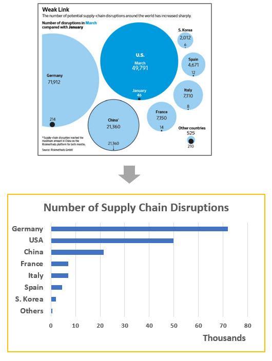
The first image is a diagram the Wall Street Journal used to show supply chain disruptions caused by the corona virus, by country (for some reason I cannot understand, The WSJ loves circle diagrams)!
Below, I've presented the same information using a horizontal bar graph.
Which is clearer? Note that specific numbers (7,110) are too much detail for the intended purpose. The axis is labelled by 10k units and so one can quickly surmise the relative differences to supply chain shocks. Adding "k" to the numerical units would be even better but I don't have time :)
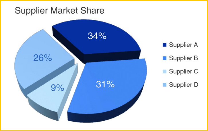
And if humans are bad at judging area, we are atrocious at volume! For the love of god and country, NEVER EVER use 3D. Here’s an example from her book:
Which of these three slices of pie is largest?
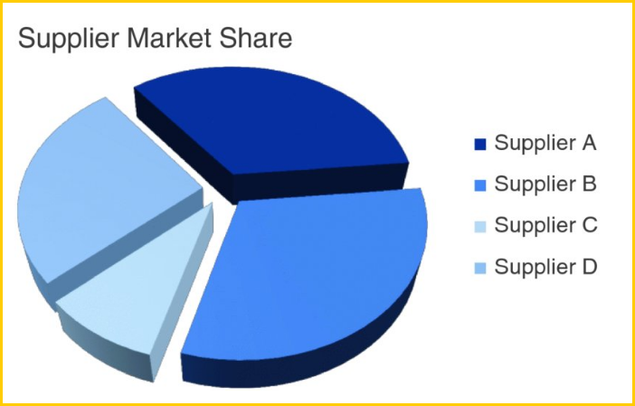
Most people guess Supplier B. And what is its relative size to the others? 35%? 40%?
It turns out the reality is that…drum roll…drum roll… Supplier B has 31% market-share and supplier A 34%. The perspective used in the graphic makes the slices near at the top appear smaller.
A few other useful tips from the book include:
The 3-Minute Story and Big Idea
Whether you are doing a sales pitch, raising capital or briefing executives it is always useful to think of your presentation in terms of a 3-minute story and a big idea.
After you’ve prepared all the slides, distill into a 3-minute story with roughly the following key elements:
-
Overall context
-
Your unique take on it aka ‘the twist’
-
The ask or recommendation
It helps clarify your thinking and sharpen your message. And, as often happens, if your meeting is cut short and you now have only 5 minutes versus the 30 initially allotted, you can still convey the gist of your presentation.
Conversely, you could start with a 3-minute story and big idea and then use it to flesh out your presentation.
Here’s an example from my friend Cesar, the founder MX360 fitness, a company that serves the Latino market in the USA. He has a two-page single-spaced executive summary of his business plan, which can be distilled into the story below.
3-minute story
Like many Americans I neglected my health as I worked long hours in banking, climbing the corporate ladder. Yes, I got that coveted VP position, but my weight ballooned to over 300 pounds causing all kinds of problems—I was constantly tired, slept poorly and suffered low self-esteem. It also negatively affected my dating and social life.
When my mother died of health-related issues, I decided to do something about my health. Knowing little about fitness or nutrition, I devoured all the information and courses I could get my hands on—DVDs, apps, books and blogs. In about 20 months I managed to transform my physique (see pic below).
[img]
As a result, my confidence shot through the roof, I had a lot more energy and felt great about myself. Soon after, something deep inside compelled me to help others with their fitness journeys, and so I started MX360 Fitness to serve my Spanish-speaking Latino community. Information alone is not enough. Most people need someone they can relate to, to inspire and teach them.
But beyond just passion there is a serious business opportunity. Latinos are underserved and yet can spend just as much on fitness related products. The kicker is, it costs about one fifth to one third of what it takes to reach mainstream Americans, to reach Spanish speakers in the US!
If you invest, we can make a lot of money together!
Big Idea
The Spanish-speaking Latino community in the US is underserved by existing fitness products, yet can afford to spend just as much. Reaching them online costs one third what it costs to reach the mainstream populace. MX360 Fitness is exploiting this opportunity—and together we can make lots money!
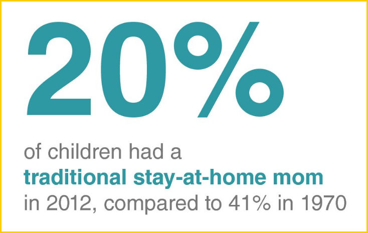
Don’t Use a Graph Just Because You have Numbers
This is especially true when you have just a few numbers. Contrast the two approaches shown below. As Knaflic points out, in Figure 1 a lot of text and space are used for a grand total of two numbers. The graph doesn’t do much to aid in the interpretation of the numbers.
In this case, a large visual of the important number and a simple sentence would suffice: 20% of children had a traditional stay-at-home mom in 2012, compared to 41% in 1970.
Figure 1
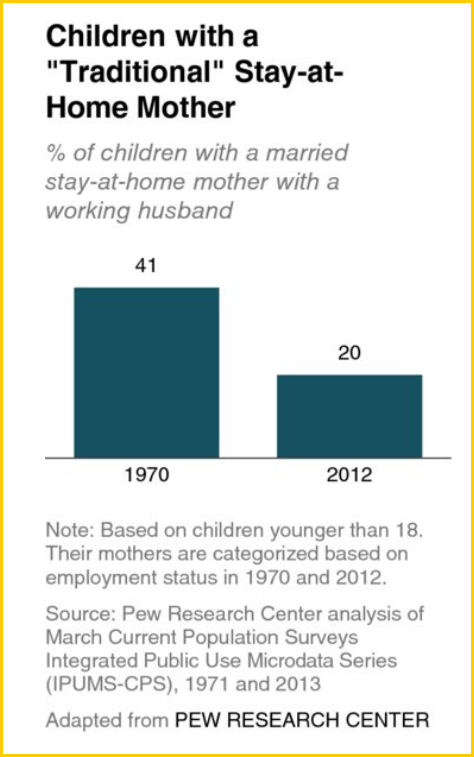
Figure 2
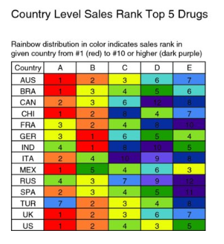
Use Color Sparingly and Deliberately
It’s easy to spot a hawk in a sky full of pigeons, but as the variety of birds increases, that hawk becomes harder and harder to pick out, Knaflic says. The more things we make different, the lesser the degree to which any of them stand out.
Here’s an example. The first uses color non-strategically and appears cluttered. It also describes in words what the colors mean whereas the second uses a heatmap to ‘show not tell’.
Too much use of color
Color used sparingly and strategically

And if you think this is just about a nice-looking presentation, here are two situations where strategic use of color came with dollar signs attached.
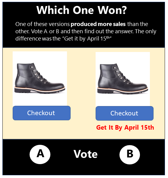
In the case study below (from our WhichOneWon Club) simply changing the color of the text “This item is available” to green, increased orders by 19%! The online retailer ran an A/B test on a large sample size and the test attained statistical significance.
Before
After