This ICO Marketing Strategy Raised Millions: 253% More Leads and 98% More Sales

A bitcoin “miner” and software developer in Nairobi, Kenya. This is one archetype of the typical ICO participant outside the US. Photo credit: Luis Tato/Bloomberg via WSJ [0]
Summary
- We helped Repux generate 253% more leads, nearly 100% more token sales and millions of dollars in incremental revenue during their ICO (Initial Coin Offering), by using our Conversion Rate Optimization expertise.
- The optimized site also helped them get meetings with some of the biggest names in the venture capital community—a big feat for a Poland-based team without the pedigree typically required (no MIT, Stanford, Ivy League, Google, Facebook, Amazon, Microsoft background).
Details
Repux a is marketplace that lets small and medium businesses sell anonymized data to developers. The developers use the data to build ‘artificially intelligent’ apps, which they then sell back to businesses. Business owners and managers use the apps to make better business decisions.Below is the original page, which linked to dense whitepaper. We don’t know who decided that an ICO requires a long, dry whitepaper but this seems to be the norm!
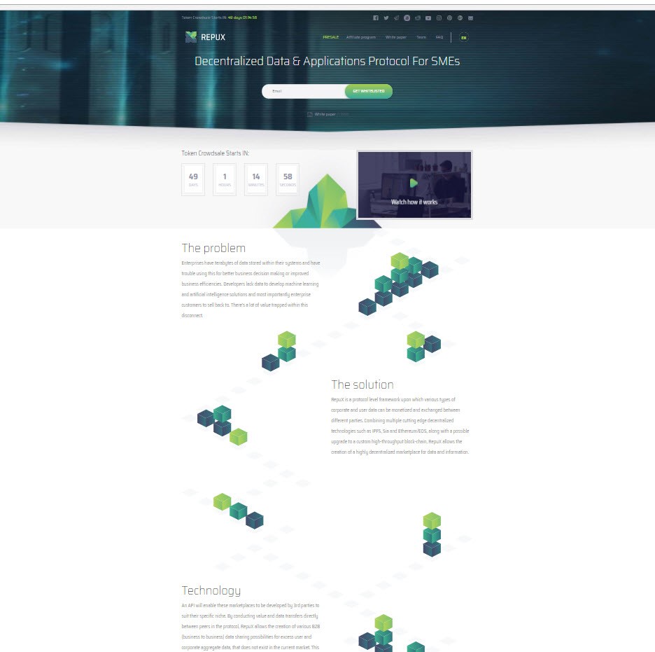
This page above suffers from several issues:
- The headline is pretty meaningless (“Decentralized Data & Applications Protocol for SMEs). Remember, as David Ogilvy noted, 90% of the success of an ad (in our case, a landing page) is determined by the headline. Visitors quickly scan the headline and if it does not hold their interest, bounce immediately. With so much content on the web [1], attention is scarce—the average time spent on a page is a few seconds and the average bounce rate is about 85%. That is why we have a series dedicated to just headline writing [link]
- The call to action is “Get Whitelisted” which is also meaningless. What is in it for me? Why should I want to “Get Whitelisted”?
- A lack of urgency to act: And yet, there is a compelling reason to do so but it was not being clearly articulated. (Get 50% OFF on the tokens if you buy before a certain data).
- Lack of ‘evidentials’: Evidentials are elements that lend credibility or reduce anxiety and include: mentions in trusted publications, well known investors or advisors, industry seals, association affiliations, specific numbers (e.g. 99% Net Promoter Score) and so on.
- Too much jargon and arcane technical language: Our research using Mouseflow’s on-page feedback feature showed that the non-accredited-investor ICO audience isn’t sophisticated [2]. They typically reside outside of the US and have a limited command of English. Most are younger men (18 – 35) who made money from speculative activities on the internet (Affiliate Marketing, Adsense arbitrage and of course other crypto-currencies). When we surveyed them, many did not initially understand the concept. In our winning page (below), we dumbed down things a lot!
Winning Page (Above the fold)
Below is the new page that produced a 253% gain in leads (email opt-ins). Coupled with the email follow up sequence shown below, it produced a nearly 100% gain in token sales.
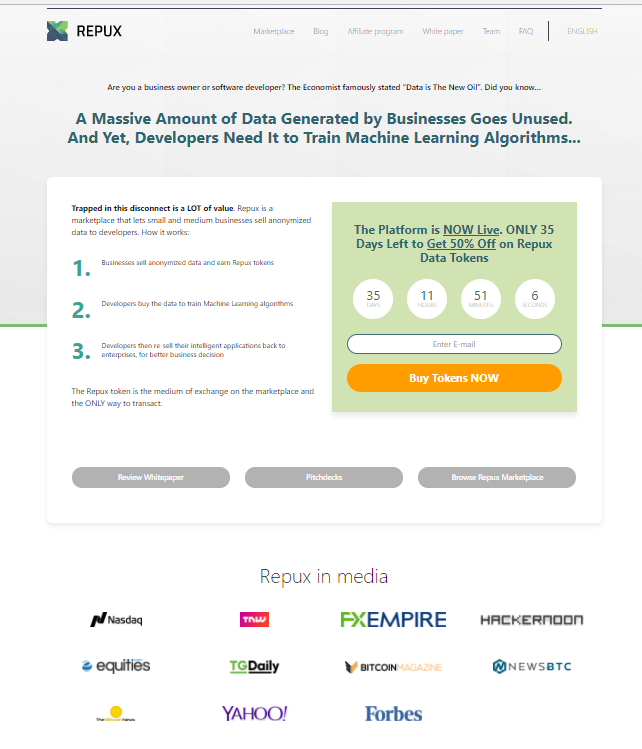
Here are few of the elements that we believe made a difference:
- Much clearer headline (which we improved upon further in a subsequent treatment).
- Simple explanation of what the company is doing
- Urgency to buy now--get 50% off on tokens if you buy before the countdown timer expires
- Solicited and used press mentions
- Social proof from the Economist. Tapping a meme can be powerful as it is always easier to swim downstream than upstream. “Data is the new oil” is a current meme.
More Persuasive Elements Below the Fold
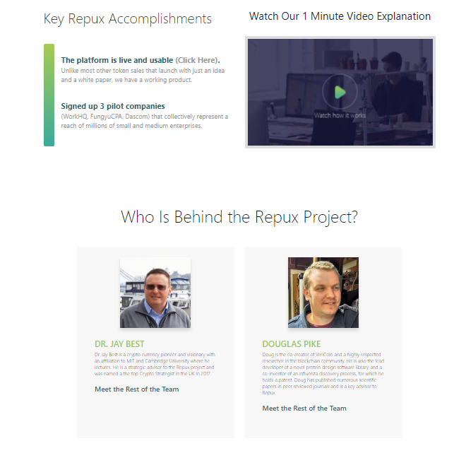
In the second span (the next screenful below the fold) we added a few more persuasive elements.
For one, we highlighted key Repux accomplishments and included bios of two advisors who are well known in the Crypto-community.
Have a working platform was an important differentiator because only 1 in 10 ICOs had a working product. Most launched with just a whitepaper!
A survey of the token buyers showed that mentioning well known advisors worked--several respondents said it was the decisive factor in persuading them to buy. Before, the advisors were buried in a little-visited page. We featured them more prominently.
Interestingly, this seemed to cut both ways. One of the non-contributors said he was initially interested because of a certain advisor’s involvement. He later chose not to contribute because he felt this advisor’s other flagship project had been mismanaged!
We also used 3 concrete examples to show how the marketplace functions and how the tokens would be used:
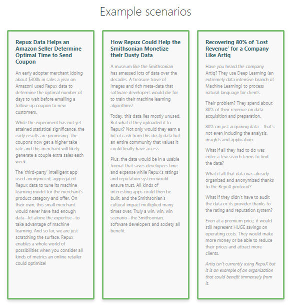
When your product is highly abstract and technical, using concrete examples aids understanding [3]: We also found this to be true when pitching to professional investors. They often asked “Can you give me an example of how this would work in the real world?”
We like long form pages because unlike a live selling situation, there is no opportunity for a back and forth conversation. The page must therefore over-correct and address every objection a web visitor might have.
Lastly, we explained why Repux is likely to succeed. We quoted Victor Hugo for good measure, to create an air of inevitability:
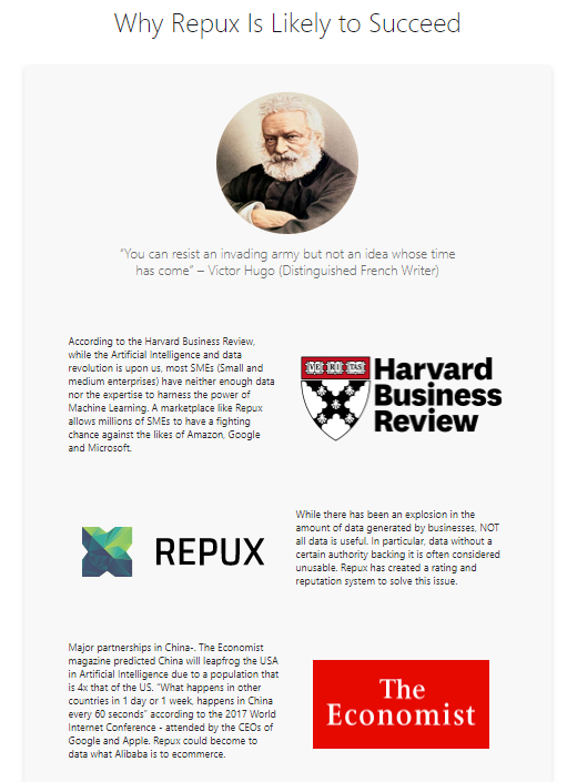
How much impact did Victor Hugo have? I don’t know, but the page did much better overall. Our experience shows that radical re-designs (that change many page elements at the same time) produce higher conversion lifts.
Once you attain a large lift, if you like, you can then do isolation testing of specific variables to determine how much each change contributed.
13% Further Lift from a Simpler Page
The page below led to a further 13% lift.
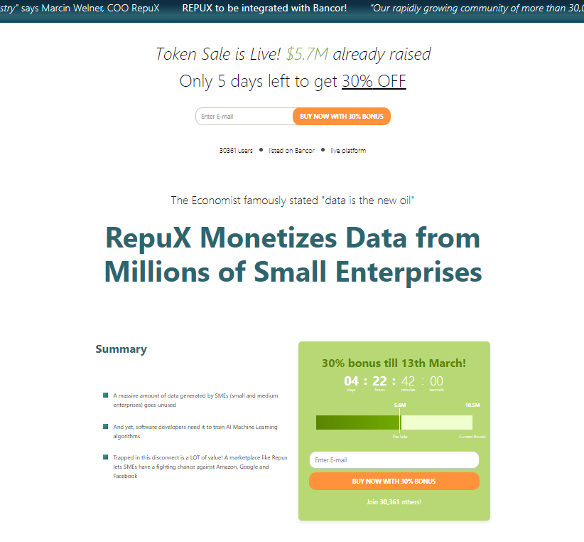
The key elements we changed were:
- Simplified the headline even further: “Repux Monetizes Data from Millions of Small Enterprises.” What was previously the headline is now stated in the bullet points.
- Added a 5 Reasons Why Repux is Likely to Succeed Section. When you number things, visitors are more likely to engage with the content. They may not read all the text but will at least skim over the numbered sub-headlines to learn what all the points are—just like power abhors a vacuum, the mind can’t seem to stand incompleteness!
- We’ve seen this in Mouseflow heatmaps. You can do this test yourself: List a bunch of bullet points versus a numbered list and with a compelling headline: The 7 Reasons Why 20,0000 Doctors Recommend Product X or The 3 Key Things You Need to Know to Make an Informed Decision.
Follow Up Email Sequence
We also created a follow up email sequence for Repux that led to more token sales.
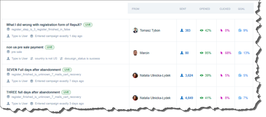
As you can see, the average open rate is north of 40%, and the goal attained (token sales) is above 8%. According to Mailchimp and Constant Contact, the average email open rate is about 20% and continues to decline. The average CTR (Clickthrough Rate) for email is about 3%.
We got more sales than most people get clicks! Here is a link to three sample emails we sent.
Our emails are effective because:
- They are educational (versus pure sales pitch). This is also important to avoid ‘burning out’ your list. If all you do is send pitch after pitch, soon you’ll be lucky to get a 1.3% open rate!
- They employ storytelling. We use a technique known as the ‘Soap Opera Sequence’. Each email creates anticipation for the next one and also refers to some interesting fact in previous ones. If a person would only have opened one email, they are now likely to want to open future ones as well as look up older ones to ‘solve the puzzle’. This leads to higher open rates for the entire sequence, and more sales.
- The calls to action are closer to the bottom, having first built up some value. Counter-intuitively, this works better but you should always test radically different approaches.
It takes a lot of work to write an effective sequence but once you do you can run it on autopilot for years, minting money hand over fist!
As customer acquisition gets ever more competitive and expensive, how well you monetize your list can make the difference between success and failure.
Conclusion
To increase the conversion rate on your website and get more sales, leads or app downloads follow these simple steps:
- Put in the work to understand why the non-converting visitors are leaving and then systematically address their specific objections. This is what “research-driven” optimization means, as opposed to re-design based purely aesthetic appeal or ‘best practices’. [4]
- Find out why the converting visitors took the desired action--and then accentuate these things.
- Capture emails and use a follow-up sequence to educate and tell stories to those who were not convinced by the website. Done correctly, this can produce 2x to 3x as many sales as the website.
And if you would like to learn more about Conversion Rate Optimization or review additional case studies, we encourage you to take our free course.
Thanks to Jon Powell, Hayk Saakian, Vlad Mkrtumyan, Nick Jordan for reading drafts of this.
Footnotes
[0] Photo is from this WSJ article: Bitcoin a Hit in Countries Where Local Currencies Face Trouble
[1] In 2013, Eric Schmidt (Google’s Chairman) estimated that “every 48 hours more content is created than from the beginning of time until 2003.” Today, this is more likely to be true every 24 hours!
[2] In the US, Repux decided to only allow accredited investors to buy tokens to avoid attracting attention from the SEC
[3] Learning Style theory holds that there are four main learning styles and people learn best when the teacher uses the learner’s style. The only style that works universally is use of examples—a teacher who imparts knowledge with examples is akin to a blood donor with a ‘general donor’ blood-group!
[4] There is a common saying in CRO that “best practices are often nothing more than pooled ignorance”. While this may be so, it is also true that only a fool learns everything directly from experience. Using a framework or theory extracted from many prior experiences can make you more productive. We like--and use--the conversion rate heuristic (framework) developed by MECLABS (see the appendix in this document

