Answer

Oct 21, 2018 - 09:52 PM
One useful tool is UserTesting.com. You may go to their site and follow the steps there. They help you select "panelists" who are qualified users to test your UX and end-to-end experience.
If it is too costly, you may also try Amazon's Mechanical Turk and essentially build your own "panel' of testers. See this: https://www.mturk.com/
Another tool we have found useful is BrowserStack.com. It lets you test your pages on real physical devices so you can see all the weird ways that various page elements appear.
It is a must for mobile if you want great conversion rates. Usually the 80/20 rule applies here. By testing the top 3 or 4 devices and top two browsers (Chrome, Safari) you will get 80% coverage.
Below are examples of the kind of things that BrowserStack will reveal:
Example 1: On the Apple Iphone X, Chrome browser the testimonials are cut off, making them less readable.

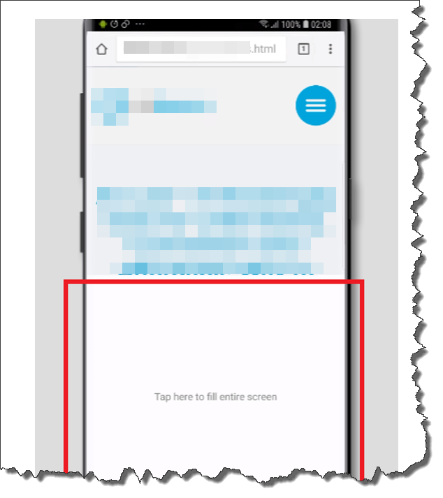
Example 2: On the Samsung Galaxy S9, Chrome, the screen does not automatically fill!

Lastly, my friend Karl Blanks also suggests doing what he calls retrospective moderated user tests:
Once you sense that you’re getting diminishing returns from your hallway antics, and your website’s remaining problems are too sophisticated to be detected by a layman, start to look for test participants who are from the website’s target demographic. For example, when we doubled the sales of a web app for photographers, we recruited photographers to test the website. You can recruit visitors directly from the website using an invitation powered by Ethnio or Hotjar.
It can be surprisingly effective to carry out what we call retrospective moderated user tests, in which you contact someone who has just completed your website’s goal (e.g., made a purchase), and ask them if they’d be willing to retrace their steps. Such people are, by definition, qualified, and have recently gone through all of the thought processes required to buy.
Take notes as they show you the path they took through your funnel, and ask them to describe what they thought at each stage. They tend to be excellent at recalling the hoops they had to jump through and the obstacles at which they nearly fell.
Counterintuitively, regardless of which of the previous methods you choose for recruiting, you tend to learn more from users who aren’t web-savvy.
People who use the web a lot tend to be better at coping with pages that contain errors. People who don’t use the web much are more easily derailed—and can therefore provide more insights.
You can read more about this and other tips from his book Making Websites Win:
https://www.amazon.com/Making-Websites-Win-Custome...
If it is too costly, you may also try Amazon's Mechanical Turk and essentially build your own "panel' of testers. See this: https://www.mturk.com/
Another tool we have found useful is BrowserStack.com. It lets you test your pages on real physical devices so you can see all the weird ways that various page elements appear.
It is a must for mobile if you want great conversion rates. Usually the 80/20 rule applies here. By testing the top 3 or 4 devices and top two browsers (Chrome, Safari) you will get 80% coverage.
Below are examples of the kind of things that BrowserStack will reveal:
Example 1: On the Apple Iphone X, Chrome browser the testimonials are cut off, making them less readable.

Example 2: On the Samsung Galaxy S9, Chrome, the screen does not automatically fill!

Lastly, my friend Karl Blanks also suggests doing what he calls retrospective moderated user tests:
Once you sense that you’re getting diminishing returns from your hallway antics, and your website’s remaining problems are too sophisticated to be detected by a layman, start to look for test participants who are from the website’s target demographic. For example, when we doubled the sales of a web app for photographers, we recruited photographers to test the website. You can recruit visitors directly from the website using an invitation powered by Ethnio or Hotjar.
It can be surprisingly effective to carry out what we call retrospective moderated user tests, in which you contact someone who has just completed your website’s goal (e.g., made a purchase), and ask them if they’d be willing to retrace their steps. Such people are, by definition, qualified, and have recently gone through all of the thought processes required to buy.
Take notes as they show you the path they took through your funnel, and ask them to describe what they thought at each stage. They tend to be excellent at recalling the hoops they had to jump through and the obstacles at which they nearly fell.
Counterintuitively, regardless of which of the previous methods you choose for recruiting, you tend to learn more from users who aren’t web-savvy.
People who use the web a lot tend to be better at coping with pages that contain errors. People who don’t use the web much are more easily derailed—and can therefore provide more insights.
You can read more about this and other tips from his book Making Websites Win:
https://www.amazon.com/Making-Websites-Win-Custome...


Add New Comment