Answers
May 25, 2019 - 10:29 AM
8 Best WordPress Ecommerce Plugins For Your Store
- WooCommerce (Woocommerce: One of The Best eCommerce Platforms)
- Easy Digital Downloads (EDD)
- Cart66 Cloud
- WP eCommerce
- Ecwid Ecommerce Shopping Cart
- Jigoshop eCommerce
- WP EasyCart Shopping Cart and eCommerce Store
- BigCommerce WordPress Plugin
May 29, 2019 - 08:29 AM
 Blue Star Coffee Roasters
https://bluestarcoffeeroasters.com/
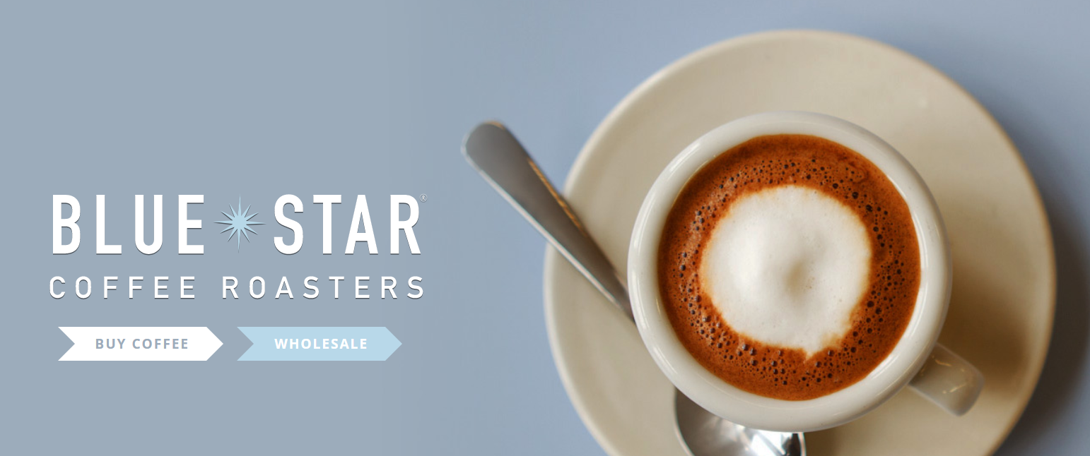
The beauty of WordPress for ecommerce is in its customizability: you can choose from (seemingly) infinite site designs that will perfectly reflect what you’re selling. Blue Star’s website makes a great example, with decadent lifestyle images dominating the page. The first thing you see is a delicious-looking cup of coffee: don’t you want to drink that?
The site is very easy to navigate with simple choices, so you can shop or learn more as you wish. It’s image-heavy, but never busy or confusing, which is key for ecommerce.
Henry J. Socks
https://www.henryjsocks.co.uk/
I never thought I needed a sock subscription, but looking at this site makes it seem suddenly appealing. The site design reflects the branding well: it’s bold, funky, and colorful, just like the socks pictured.
The navigation bar at the top is short and sweet, so shoppers don’t become overwhelmed with options. The choice to start a subscription is immediately available on the homepage, and I like that you can sign up for the email list without getting interrupted by a popup. Scrolling down lets you quickly see examples of the products, too.
While the design is a bit loud, I think it works well for the fun, frivolous products sold. It’s key to know your audience: the same bright images and color scheme wouldn’t probably work as well for a high-end luxury sock brand, for example.
Protest Sportswear
For clothing ecommerce brands in particular, the landing page must function the way a shop’s window once did. It needs to visually draw people in, showcasing a lifestyle that they’ll want to buy in to. Protest Sportswear’s site does that beautifully.
At the top is an image that shows the lifestyle, not just the clothes. Scrolling down, we see more images of the sportswear in action, with clickable pictures to draw you into the site’s blog section. The rich color scheme is grounded with outdoorsy blues and greens, so it looks organized and fresh.
The options to shop by look or collection also make it easy to navigate the variety of options. This helps shoppers avoid the “What should I look at first?” decision fatigue that can drive them away from a site. Don’t give too many options right away - instead, keep it simple and visually pleasing.
Paper Tube Co.
I can think of nothing more bland and boring than a paper tube, and yet a single look at this site makes the paper tube chic and trendy instead. All it takes is a single pleasing image of the products to convince me that this packaging is good. The rest of the homepage is simple and text-driven, so that the single image at the top stands out even more.
You get two clear options: order paper tubes or create your own. The site makes it easy to take the desired action right away, and if I want more information about the products, it’s well-organized on the scroll down.
The carefully selected wording (“Enhance your unboxing experience” and “Viva la tube!” stand out to me) also plays a crucial role in the branding. The message is clear: paper tubs aren’t boring - at least, not if you order them here.
The Smokehaus
Although this site took a bit longer to load on my laptop, the feature that showed how close it was to loading made the wait seem easier. I also like that you’re immediately greeted with simple, non-obtrusive instructions on how to navigate the site.
And I do love this navigation: with a side arrow or scroll, you can flip through individual products quickly. It’s unique, sleek, simple, and shows off something that’s hard to sell online (meat!) to great advantage. This website has managed to capture the experience of stepping into a clean, trendy shop to make your selections.
JOCO Cups
This brand does a beautiful job of answering “Why buy this product?” straight away. You’re greeted with a clean, pretty image of an unusual-looking cup first, which piques interest. Immediately below it, a bit of text tells you everything you need to know: it’s eco-friendly and good for the planet. This brand knows its audience and speaks to them directly.
Some ecommerce brands fail by trying to make a neutral site that will appeal to everyone. Instead, JOCO designed a site for a specific group of people. Those who aren’t interested in artisan cups or saving the planet need not stick around.
I also love the way the landing page is organized into blocks or sections that you scroll through. There’s a lovely balance of large images and short text. The minimalist design makes me want to stay on the site and learn more.
Jack Rudy Cocktail Co.
https://jackrudycocktailco.com/#
Just looking at this site, which sells bar goods and mixers, makes learning how to mix drinks seem fun. The white background lets the colors of the mixers stand out. Below the first image, a single sentence sums up what the brand is all about.
With this product, it could have also worked to feature images of cocktails or people drinking them and enjoying life. However, the simplicity of the images lets the nice colors and packaging stand out. This creates an unspoken selling point: these products will look nice on your shelf, in addition to being high-quality.
As you can see, there’s more than one way to design a nice-looking ecommerce site with WordPress. But a few patterns stand out. Always use ultra-high-quality images. Don’t put too much info, too many colors, or too many options on a single page. Know your target audience, and design a site that’s just for them. If you follow these best practices (especially on a site that already has good traffic), you should get great results.


Add New Comment