Answers

Jul 31, 2019 - 08:47 AM
Would probably need some more info to help you solve this one.
First, check to make sure there isn't something broken in your cart that is preventing someone from using that code. That means testing it in multiple browsers and environments.
Second, see if you are being sent to a promotions or spam folder (if you send the code). Maybe they aren't even getting access to the code at all (unless you are showing it to them upon subscribing)
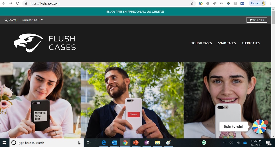
Third... if you do have it setup to show them the code at email submission (my guess is you're referring to the SPIN AND GET A CODE slide in)... is it actually rendering correctly on the browsers that most people are using to access your site (found via Google Analytics)
When I tried to use it... I got a weird red blank square. After I did it a couple more times, I ended up getting a code.
I remember my brother called me one time to help him solve a CRO puzzle on one of his prominent landing pages. He said he coded it himself, and that the conversion rate suddenly dropped. I told him to send me a link to the page so I could look at it.
He never sent it to me. When I followed up I figured out why... when he went to send it to me and checked to make sure it worked, he found that the SUBMIT button wasn't rendering. Yup.. that was the conversion rate problem... it was actually a coding problem.
That's just one of the many many stories where quality assurance checking (QA) is so so important.
And if you've eliminated all the technical and coding possibilities... and only then... ask yourself:
a) is the discount code substantial enough? The fact that some get 5%, some get more... well yeah, I don't want to use a 5%... not big enough
b) are you offering it too early? Many people will just sign up for something they think they might need and then they will see you don't have what they want... or that it devalues or DISTRACTS from finding something they actually want... or they will actually (yes) FORGET THE DISCOUNT CODE ENTIRELY (even though it was a click or two ago... visual memory is a real problem for a lot of people... I recover lots of money solving THAT problem alone, especially in email campaigns)
Im convinced you have a visual memory issue here. Not only that, the code is created with an individual time limit. They literally have to copy and paste it somewhere AFTER they MAYBE will find a case they like.
c) have you actually followed up with them in a specific targeted email campaign (and not a newsletter)?
Guessing no?
d) presuming you have their email, you probably have some way to track them (via cookie) and their last visited page (using HubSpot or something) - have you followed up with them personally as if they were in a real brick and mortar store and you saw them looking confused and considering leaving?
Also guessing no...
And then... if you have done absolutely every single thing above... you have to ask... do they even like what I have to offer at my shop? Is my target audience wrong? Is the traffic itself not as motivated or valuable?
Bottom line... discount code is not the holy grail. It's like a key. It can unlock a special door... but it has to actually fit the lock... work in the lock... and people have to remember to carry it with them, or be able to locate it when they actually get to the door... etc.
And a key, no matter how special... to a door... no matter how special... isn't special to everyone. It's only special to the person that realizes your shop and the deal IS relevant, special, desirable to them. Discounts don't solve value proposition problems.
My hypothesis is that you might have a combination of coding issue AND a visual memory / timing issue (the code isn't worth anything UNTIL they find a case design they like). Plus, some of the discount may not be high enough... especially if you TEASE them with 25% only to give them 5%. Even then, what I got wasn't clear on pop-up.
Does this help? Can you provide more context?
-Jon

Jul 31, 2019 - 11:28 AM
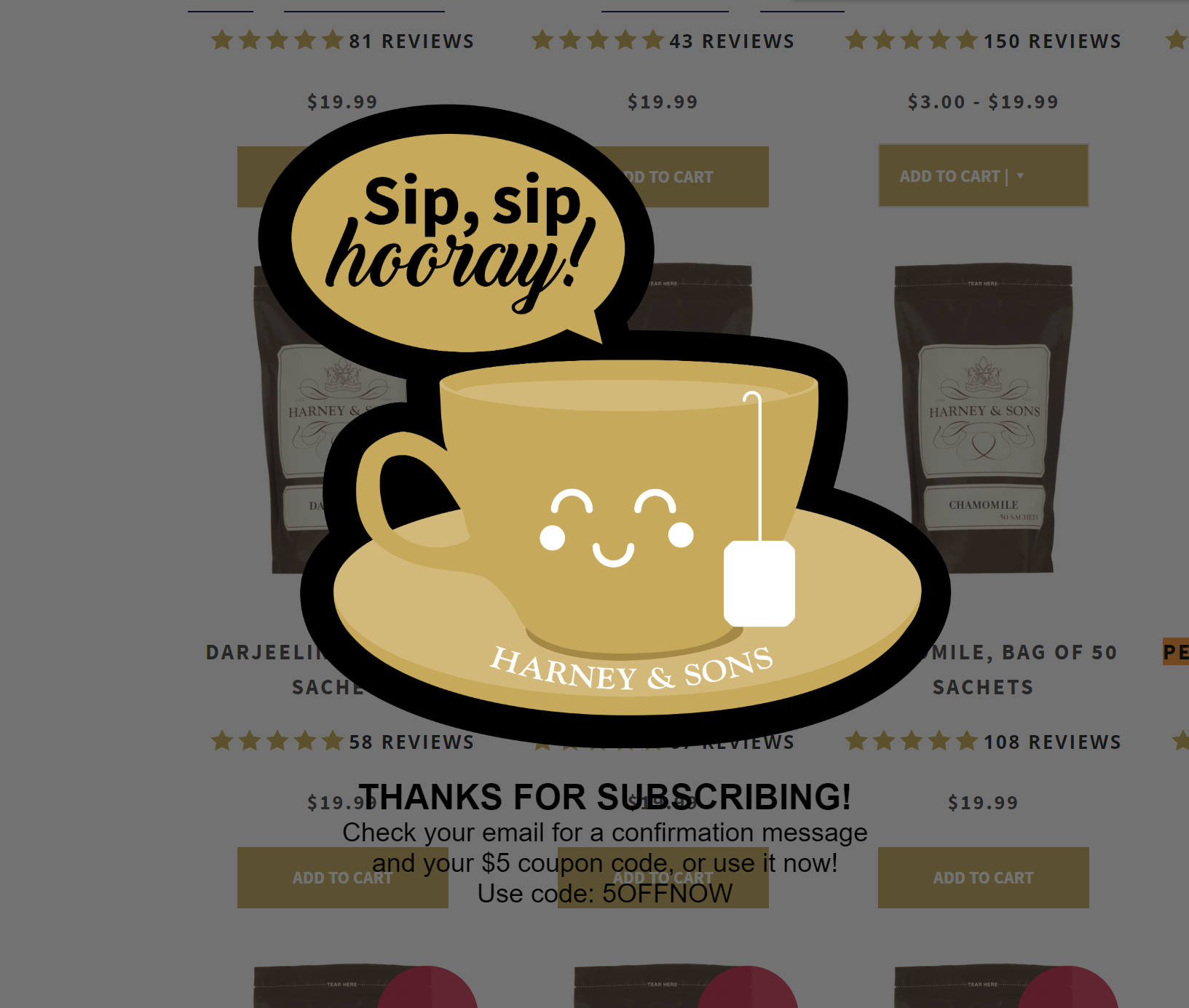
Oh, and as fate would have it, i encountered a great example of a rendering issue just now...
How long does it take you to find the discount code?
How hard would it be to rememeber it if you didn't literally copy and paste it into a word document?
By the way... this is my FAVORITE ecomm tea place. Meaning... anyone can make these mistakes. This was just after i submitted an email

Aug 01, 2019 - 09:49 AM
Yes, my cart process has already been tested several times and works flawlessly. Haven't encountered anything there.
The email sent directly after subscribing goes to the subscribers main inbox, according to my tests. But I'm sure some providers may put it in a different folder- but that's out of my control.
The box that appears after subscribing works well on the browsers my audience is using- which is mostly mobile chrome and safari. (95% of my audience is from mobile devices).
I agree that the 5% discount was way to little, so I changed the minimum discount to 10%. But the vast majority of subscribers will get a 20% off coupon as I set that as a 50% chance.
Also, thank you for the advice. I've been told I need to work on a value proposition for my product, as in- why should I buy from you? my phone case is fine, why do I need a new one? etc.
Do you have any advice on how I can go about doing this? I'm having a hard time coming up with an effective proposition that isn't to generic like "your phone case is boring" I need something better than that.
Once again, thanks!

Aug 04, 2019 - 08:04 PM
So after looking at a little detail, i would again say:
1) Visual memory. You give people a unique code, and only 24 hours to act on it. Their chances of finding it / remembering it are hard. AND on the submit success screen, you don't reiterate the actual discount amount. Because the wheel is below the submission field, i can easily miss the discount.
2) I used my conversionwizards.com email address and it went straight to junk. You might want to add some instructions on your submit success screen on checking the junk folder.
3) Prices are a bit high for cases. When i cracked the back of my phone, i just wanted a quick thin case that didn't look horrible. When i see case prices already 29.99 or 24.99, i'm not even trying to do the discount in my head to see if it is reachable.
4) which means the primary thing driving case sales are the designs.. and given the prices, people really got to like them. To an extent you can't avoid this. When i worked with a U.S. Swimwear ecommerce giant (and mail catalog giant), variety of designs was a huge driving factor in increasing conversions.
What do i suggest?
First... fix your subscribe and save. Put the form field below the spin wheel so people see that they are spinning for a big percentage.
Second... fix your submit success page. Put the actual discount amount on there... in a BIG font.
Make the discount code a HUGE font. Tell them to check their email (and junk mail) to find another copy of it
Put a countdown clock on there and put a countdown clock in the email.
You might want to test dollar amounts instead of percentages.. to help reduce the math challenges. Percentages may have a higher perceived value, but you are forcing people to do math AND remember your code. If the code is in the header on every page, then that isn't so bad. So i'm not going to say which way to go... just saying that you are requiring the brain a lot... especially on mobile where its harder to copy and paste.
Next... you need to email these people AGAIN when there's a few hours left. Some people don't act until the last minute. If they forget... they forget. You help them remember? and then sweeten the deal... give a good satisfaction guarantee... they might make the jump.
IN terms of sweeten their deal, add an extra 5% in the "final chance" email.
Next... when someone comes in on the site, you need to let them know right away why you are more than JUST the designs you have. Designs drive case sales. What helps mitigate that is a solid value proposition.. something that says "i like this design... not love it...but would totally settle for this because of ______________
Also, consider showing people most popular... most purchased... phone cases are part of the social scene... how they represent themselves, etc... so its even more important to know what others like, think is cool... etc etc etc...
There's just a ton of things...
This should be enough to start.


Add New Comment