Answer

Mar 29, 2020 - 10:51 AM
Nice site and brand! A couple of quick thoughts:
· Whenever possible, avoid reverse text (White on a dark background). Usability tests show that it is harder to read and things that make it harder to read often shave a few points of your conversion rate--especially on mobile.
· As someone else has noted, show the products faster. Within the first screen-full of clicking "Let's Shop" maybe try having the "Shop by" text and then two boxes underneath, one representing "by brand" and the other "by category" with appropriate visuals in each. And Then once I've picked one of the two options, visually show me the sub-options. Eliminate the extraneous copy and move it to an "our story" page. Artisanal brands like yours thrive on stories but they should not clutter the shopping experience. I show visually what I mean:
Current
Suggested
· Get rid of the carousel. These almost always hurt conversions, except for static ones used to show multi-item lists e.g. testimonials. Decide what is most important and have it occupy the top stop permanently, arranging everything else beneath it. We've written about this with supporting evidence here: Why Carousels Are Evil: https://capitalandgrowth.org/answers/Article/2980816/Design-by-Committee-Why-Ca
rousels-Are-Evil
· Use software like Mouseflow to see how visitors are interacting with the site. By studying the heatmaps and watching a couple dozen recordings you will get a sense of what could be hurting conversion and the specific elements to tweak
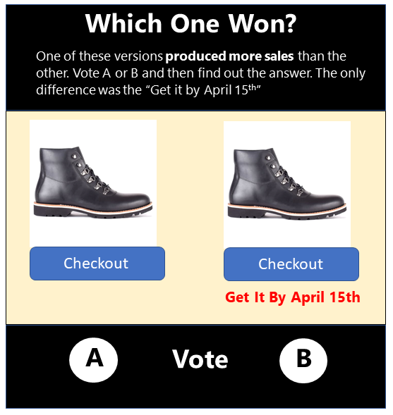
· And once you have a good sense of what to change, start course grained A/B testing. Test headlines and radical redesigns, given your low traffic. And then look for leading indicators like clicks on the "shop now" or "add to cart buttons". When you have more traffic, you can track actual transactions. While people like me can critique and recommend things, even best practices that worked in one scenario will fail in another. CRO (Conversion Rate Optimization) is finnicky in that sense.


Add New Comment