Make More Money: The Misunderstood Call to Action (Part 2)

As we discussed in Part 1, the call-to-action is not as clear cut as marketers tend to make it.
It’s not just a button or link.
To the customer, the clickable thing has no meaning outside of its surrounding context. To them, the call-to-action is a request based on a cluster of content related to that request.
Why? Take this classic example of context from Leonard Mlodinow’s book “Subliminal.”
Read this sentence:
“The cooking teacher said the children made good snacks.”
Now read this one:
“The cannibal said the children made good snacks.”
The meaning of the word “made” has significantly changed hasn’t it? In fact, the meaning of that word is dependent on the context in which it is placed.
The same is true here; not just for the content directly related to the button/link, but also how that call-to-action cluster relates to the rest of the content.
What, again, does a call to action cluster consist of in the mind of the customer? It usually consists of:
- Call to action Header
- Call to action Description text
- Form fields (sometimes)
- Something clickable (a link, a button)
- Additional Information or graphics next to that clickable thing (above, below, to the side) to influence someone’s desire to click it
So how does one adjust this presentation of information to get double and triple-digit gains?
As mentioned in Part 1, I had the privilege of running a meta-analysis on this topic, spanning 150+ conclusive experiments and 40 brand-side marketer case studies.
And what I discovered is FIVE COMMON OPPORTUNITIES to make call-to-action content clusters perform better, either by changes you make in the cluster, or changes you make as it relates to the content leading up to it / around it.
OPPORTUNITY 1: The Offer Angle
This seems all-too basic, but it happens to be a very important area that people miss all the time.
In Part 1, I showed you one example of how the SAME deliverable (debt analysis) was re-framed based on what the customer wanted (discover your monthly payment), and what the customer is excited about.
The principle in action here is framing. Is the overall call to action you are optimizing framed around something they actually want?
Here’s some situations where this might be an issue:
- When you have just one primary call to action
- The title and/or descriptive text feels either too specific or too general
- The title and/or descriptive text focuses more on what they do, rather than what they get
What can you do to get a quick win?
- Start your header and/or button text with what they get instead of what they have to do
- Test a completely different offer (see article Part 1 example)
- Add a different call to action (so you have 2, not 1) aimed at a completely different level of interest (see example below)
(the result of this test that I managed was 229% increase in qualified leads.)
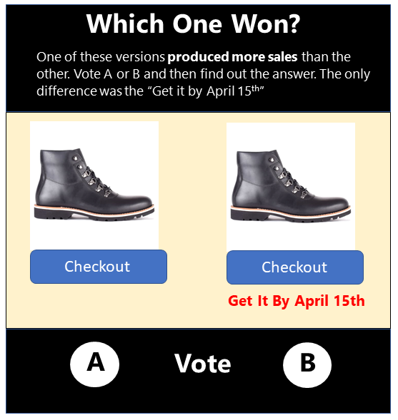
OPPORTUNITY 2: The Timing
Even though we’ve been talking about presentation, we can’t forget that the timing of an ask can be just as important.
It’s just like with developing relationships. How early, or how late, your ask will influence the response you get.
Also, I want to emphasize that this is NOT just about placement… it’s also about commitment level.
There are times when you want a low-commitment call to action (learn more), and times where it needs to be high commitment (buy now).
Here’s some situations where this might be an issue:
- When you have a call-to-action that’s made very early (top of the page, for example)
- When you have a call-to-action that is either a step-based commitment (learn more), or one that is an end-conversion commitment (buy now)
- Neither is bad, the key is when to use each particular one
- When form fields are involved (this aggravates the issue if timing is questioned)
What can you do to get a quick win?
- Test moving the call to action towards the end of the content as opposed to the beginning
- I’m sorry if I’ve offended all of you “CTA above the fold” champions. There is no fold.
- Similarly, try moving the Call to action cluster to a different place on the page, not necessarily to the complete bottom
- This experiment below resulted in 87% more purchases
- Source: MarketingExperiments web clinic
- Also, try spreading the calls to action over a few steps (I wouldn’t quite call this compliance laddering, but more of a momentum of “yes”)
- This experiment resulted in 108% more conversions.
OPPORTUNITY 3: Individual Contrast
Have you heard of camouflage? Yes, the clothing that helps you blend in to the forest or natural surroundings, making it harder for you to be found.
Well the last thing that you want is for your desired action (or key actions) to be inadvertently camouflaged on a page due to surrounding elements or presentation.
Check out this example: Can you quickly and easily see where you can add to cart? How many seconds does it take?
(Source: MarketingExperiments web clinic)
Eliminating the camouflage, especially in the above case, means using different colors, sizes, positioning, or shapes in your call-to-action content cluster to create distinction against the offer content.
For example, this treatment below did just that, both with the button and the guarantee, and achieved a 16% increase in sales.
(Source: MarketingExperiments web clinic)
Sometimes eliminating camouflage means narrowing the number of options down for each distinguished category just so someone doesn’t get completely overwhelmed:
This test resulted in a 177% increase in click-through, and used the follow-up page to narrow to the degree level.
Here’s some situations where this might be an issue:
- When you have a call-to-action cluster that’s not visually distinct on the page or marketing piece
- When there is a generally higher amount of difficulty processing information on the page
- When the call-to-action cluster does now naturally follow the main offer in eye-path
- When you have a homepage or directory page with multiple options and a few heavily desired, targeted options
What can you do to get a quick win?
- Try reducing the number of primary calls-to-action on the page. If you have more than three, you could have a problem
- Try adding contrast in size, shape, color to help draw it out
- Try moving the call to action into the main path of the reading eye
OPPORTUNITY 4: Group Contrast
This may not make sense at first if you’re really into landing pages, but sometimes multiple options do indeed perform better than a single, focused one. And some academic studies have shown that more options can actually mean more action.
But the key in that research, and also in all the case studies I have reviewed, is that the options (when viewed as a group) must feel like they are very different from each other and present a sufficient variety.
For example, see this:
In the above test, when the existing options were presented more clearly as separate from each other, a 63% increase in revenue per visit was recorded.
And when it comes to this challenge of multiple calls to action, any given visitor should only really identify with one primarily, not all of them (or none of them), otherwise the decision gets harder to make.
Because it’s not necessarily variety in of itself that gets the gain, but rather the idea of being able to speak to different groups distinctly, with focus, all in the same space.
Otherwise everything ends up feeling the same to the visitor, or nothing looks interesting, and no decision is made.
In the below case study, it is hard on the top version for a person to distinguish where they fit and the path they should take.
When the options are changed to fit three very distinct customer types (in this case, stages in the customer journey), the result was significantly more people acting overall (331% increase in leads, not clicks) because each individual could immediately find where they fit based on the stage they were in the cycle.
So as a recap…
Here’s some situations where this might be an issue:
- When there are two or more similar call-to-action clusters on the page
- When there are two or more primary customer profiles coming to the page
- When there are two or more incremental levels of motivation in a single customer profile.
What can you do to get a quick win?
- Align each call-to-action cluster path to distinctly different customer interests
- Align each call-to-action cluster path to distinctly separate products
- Align each path to separate steps of the process
OPPORTUNITY 5: Action Support
One of the major mistakes we make in leading people to a desired action is to support them at a moment of hesitation or concern.
And in many cases, this can be the tipping point. We choose the right angle, we present it at the right time, we make sure it stands out, but during the decisive moment, they bail. Why? Because they have unanswered questions, like:
- What if I don’t like what I get?
- What are others saying?
- Is it really worth the purchase?
- Should I really move forward on this?
And these things are often emotional, not easily explained away by logic.
So at that critical “click or don’t click” moment, where something so trivial to us starts seeming like a big deal to them, how do we handle it?
Do we try to answer emotion with logic? Or do we answer emotion with something that influences emotionally?
In this example, even in the add-to-cart stage, the presence of a guarantee increases purchases by 37%.
(Source: MarketingExperiments Web clinic)
And in this example, we see how a single testimonial under what could be called the worst button ever (submit!) results in 35% more leads
Here’s some situations where this might be an issue:
- When your call-to-action (finish your purchase, or even, donate) requires information through a form
- When the call-to-action is close to the point of transaction
- When the call to action is a high commitment (even though it may not be close to transaction)
What can you do to get a quick win?
- Overcorrect for their concern with emotive influencing content like testimonials, guarantees, “did you know” or “why we need this” content
- Do so very close to the point of actual action in the call-to-action cluster (where the hesitation occurs)
The Big Takeaway: People View Web Content Holistically.

When you give someone a page, or a digital experience, they see and experience something more like a soup, not a set of all the individual ingredients.
And while they can distinguish some main ingredients in the soup (the call to action content cluster for one), they cannot separate their understanding of it apart from the soup itself that it has been sitting in. (that main ingredient’s flavor is affected).
Therefore, we need to think about our call to action experiences in this way, NOT just as the clickable thing. And not even just as the content cluster the visitor sees, but also the greater context in which they see it.
As the spiritual father of Landing Page Optimization (Dr. Flint McGlaughlin) likes to say “there is no such thing as a landing page. It does not exist. There are only thought sequences in the prospect’s mind. These are what we optimize.”
Jon is a Principal Consultant with The Conversion Wizards, a leading CRO (Conversion Rate Optimization) consultancy.


