Answers
Nov 03, 2018 - 07:02 PM
Don't forget about MySpace's "my _____". It was glorious.

Nov 09, 2018 - 11:19 AM
We are considering a re-brand so it would be nice to learn from both successes and failures.
Let’s start with what not to do: here are some of the world’s biggest re-branding failures.
1. Mozilla
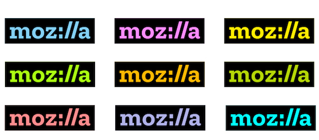
Mozilla Firefox seems like an outdated relic today, compared to more popular browsers like Google Chrome. Part of this can be blamed on branding.
The struggling company unveiled its rebranded logo design in early 2017. The new logo was stylized as “Moz://a,” a reference to the URL code that precedes web addresses.
Ten years ago, this might have been a creative and successful rebranding example. But now, referencing super-obvious internet stuff just seems out of touch. Instead of clever, it reads as cheesy. Suddenly, Mozilla looked like the clueless grandpa who’s mystified and fascinated by every minor detail of the internet.
The design was a bit too much of a throwback to the early days of the internet. It’s better for rebranding designs to focus on where a company is headed, not where it’s been.
2. RadioShack
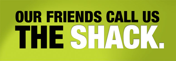
One of the funnier recent rebranding fails was RadioShack’s attempt to rebrand itself as “The Shack.”
While RadioShack may not be the sleekest, most modern name, it’s recognizable, and people know what the brand has to offer. The reason the company failed has less to do with branding than with an outdated business model. But rather than focus on effective solutions, like building a bigger ecommerce presence, the brand tried to appeal to modern consumers with an ill-conceived rebranding attempt.
Not only does “The Shack” offer zero information about what’s being sold, it also offers negative connotations of creepy, rundown buildings. No one wants to visit a place that’s simply called The Shack. Ultimately, the brand ended up filing for bankruptcy.
3. The Gap
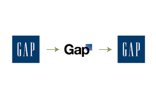
If it ain’t broke, don’t fix it. This is advice that many companies could stand to learn from when it comes to rebranding, and The Gap is a perfect example.
The brand has used the same iconic logo for decades. The one time they tried to unveil a major change, they changed it back within a week. Not only was their new logo unnecessary, it was boring. The sans-serif font and random gradient square looked like something you might see at a run-of-the-mill tech company, not a fast-fashion brand.
Many brands want to reinvent their timeless logos. But to do it well, the original design should be mostly preserved, with a modern twist. Making a complete break from recognizable branding doesn’t help anyone.
4. New Coke
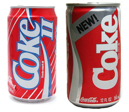
Coca-Cola also made the mistake of trying to change a classic product that customers already liked. In 1985, the brand introduced “New Coke,” which was officially titled Coke II in 1992.
This rebrand came in response to competition from other sodas, like diets and Pepsi. It was actually sweeter than the original, and did well in blind taste tests. However, people didn’t take kindly to the New Coke marketing.
In just three months, Coca-Cola started selling its original formula again, now labeled Coca-Cola Classic. The spike in sales that followed actually turned this failure into something of a success. A few people believe it was all a conspiracy to make more money, but the brand maintains that it was an accident. They kept Coke II on the market for a few more years before it fizzled out.
5. Coors Sparkling Water
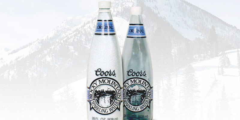
The beverage market is rife with rebranding failures. Coors, another beverage giant, tried to expand its offerings by adding bottled sparkling water in 1990.
In some ways, the brand was ahead of its time, as flavored sparkling water remains a major trend in modern markets. But the Coors approach was all wrong: they kept the Coors name and logo, long associated with beer, on the front of their new water bottles.
The result was a bottle of what looked like alcoholic sparkling water. Coors couldn’t successfully convince their customers to drink water with a beer logo on it, and pulled the product after two years.
6. The SciFi Channel
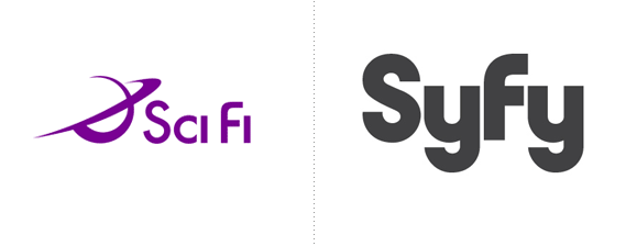
Well, the SciFi channel is now the SyFy channel, in an example of a terrible rebrand that stuck.
SciFi couldn’t be trademarked, but SyFy could, and the company’s marketers seemed to believe that the new spelling would appeal to a younger, slang- and text-focused demographic. It did catch the attention of a new demographic in one way: Syfy is slang for syphilis, according to some.
Switching from a recognizable term to an odd misspelling seems like a poor choice. But the new spelling has stuck around in the years since anyway.
Now, let’s take a look at what happens when rebranding goes well.
1. Old Spice
Old Spice was long associated with being literally old -- it was the outdated deodorant choice of men with grandchildren. But all it took was a silly, internet-inspired video to get young people talking about the brand.
The marketing team effectively tapped into the type of nonsensical humor that millennials gravitate to, and used it to make an infinitely shareable marketing video. Combined with some new product offerings, such as new scents, this straightforward rebranding turned their demographic around.
2. Target

Not all rebranding has to do with logos and imagery. Sometimes, it’s more about what’s actually being sold.
Target was on par with stores like Walmart for many years: reliable, but not special. However, when the brand started partnering with high fashion designers to make affordable, chic clothing lines, things changed. Suddenly, Target wasn’t just a source of necessities - it was also a one-stop shop for affordable stylish clothes, bedding, and more.
Now, Target continues to offer designer partnerships for limited-edition lines that often sell out fast. It also offers other things its competitors don’t, like natural cosmetics from small indie companies. Sometimes, setting yourself apart from the competition is as simple as selling what they lack (without sacrificing affordability).
3. Apple
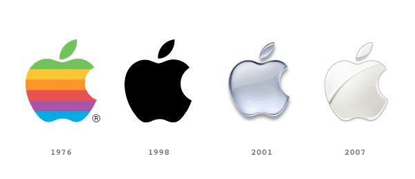
Apple is the quintessential rebranding success story. In addition to upgrading its logo to something sleek and modern, but still recognizable, the brand has also upgraded its whole brand image over the years.
Much of this vision can be attributed to the wildly famous Steve Jobs, although he certainly couldn’t have done it without a solid team. Apple beat the competition by making tech seem both essential and approachable. The simple, functional design of all its branding elements, from the logo to the store interior, appealed to tech experts without driving neophytes away.
Similarly, its products became high-tech and capable, but still user-friendly and intuitive. This allowed the brand to appeal to the broadest possible base of consumers. The experience-focused marketing and minimalist look inspired countless other brands to do the same, but Apple was the pioneer.
Apple’s rebranding succeeded because it stood out from its competitors, and offered a new approach to tech products, making them trendy consumer items that belong in everyone’s life. This is a great example of how rebranding can seamlessly incorporate everything from logo design to new product offerings, and why branding consistency matters.
4. Starbucks
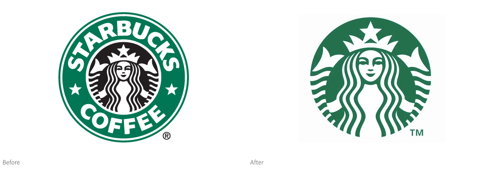
Starbucks made a bold move in 2011 when it pulled the brand name from its cups in favor of just the logo.
For some brands, this would have harmed their brand recognition: they changed a deeply popular logo and removed their recognizable name. But Starbucks by that point had the power to get away with it, and the result was that their cups became more recognizable than ever. The simplified green logo could now be spotted a mile away.
But this success comes as no surprise when you look at the company’s history. They’ve successfully changed logos and added new product offerings many times over the years. Not all were perfect successes - the sale of beer and wine at some locations was introduced only to be pulled shortly after. But they’ve balanced out these small failures with bigger wins.
5. Pabst Blue Ribbon

Sometimes, a rebrand that wouldn’t fly in one country does well in another.
In America, Pabst Blue Ribbon (PBR for short) found success as an affordable beer enjoyed by hipster millennials and blue-collar workers alike. However, when Pabst introduced their products to China, they added a high-end beer that retails for $44. This “Pabst Blue Ribbon 1844” is aged in wooden casks, unlike the pale, tasteless American version.
This is a perfect example of understanding your market. American customers know and love PBR as it is, and wouldn’t be receptive to paying $44 for a high-end version of the cheap beer. But Chinese customers love high-end beverages, and Pabst took the opportunity to make a name for themselves in a brand-new market by offering what the people want.
6. Domino’s
For years, Domino’s was known as the place to go for terrible pizza. Today, it’s one of the more popular affordable pizza chains, thanks to a rebrand that took its bad reputation into account.
Rather than living in denial, Domino’s started to release self-deprecating marketing materials that got customers to laugh, and give the brand another chance. This self-aware marketing was coupled with a genuine effort to improve the product, and customers took note.
Domino’s launched an improved pizza recipe alongside the new marketing approach, plus better pastas, sides, and more. The company also offered modern ways to order their products, so there’s no more need to make an outdated phone call (although that’s still an option). These changes helped them attract new customers, and possibly even win back former ones.




Add New Comment