Answers

Jun 04, 2019 - 06:30 PM
Many big voices in ecommerce, including Shopify, warn against using dark patterns. It seems strange, then, that so many companies still adopt these tactics.
Dark patterns are incredibly prevalent, but range from innocuously obnoxious to potentially harmful. At the innocuous end of the spectrum lies things like tricking you into signing up for an email newsletter. At the more harmful (but very familiar) end is the practice of tricking someone into paying when their “free trial” ends without warning.
The definition of a dark pattern also depends on who you ask. For example, some would call content marketing that poses as an informational blog post a dark pattern. You’d be hard-pressed to find a modern ecommerce brand that doesn’t use a dark pattern of some sort.
There is a bigger pattern to dark patterns: brands knowingly doing things that annoy customers. Pop-up ads are a great example. While pop-ups aren’t a “dark pattern” by definition, they serve brands, not consumers, by trying to irritate consumers into taking action. Consumers aren’t fans of pop-ups, but does that really matter if there’s a payoff for brands?
Like pop-ups, dark patterns offer great conversion rates, which is where the appeal lies. So the question is really: are conversion rates worth sacrificing UX for? In the short term they might be, but in the long term, growing mistrust from customers can seriously harm a brand.
Brands also face other potential drawbacks from dark patterns, especially as the conversation about internet privacy heats up. In 2015, LinkedIn paid $13 million in a class-action lawsuit for a dark pattern involving emails. Similar lawsuits have been rare, but could become more common as new rules crack down on online privacy violations.
Even for dark patterns that don’t carry legal risks, though, there is the risk of alienating consumers. So far, many brands have decided that this is worth it. And while these patterns have gotten a lot of bad press (the WSJ piece is only the latest), they vary so widely that I don’t think you can judge them all the same way. As mentioned above, there is a spectrum.
To an extent, all marketing relies on a kind of trickery. Brands must convince you that they offer something better than the competition. But in reality, many competing brands offer items of virtually identical quality. Customers expect brands to try to push them towards a certain action, which is ultimately what dark pattern design does. The problems start when that push becomes uncomfortably forceful.
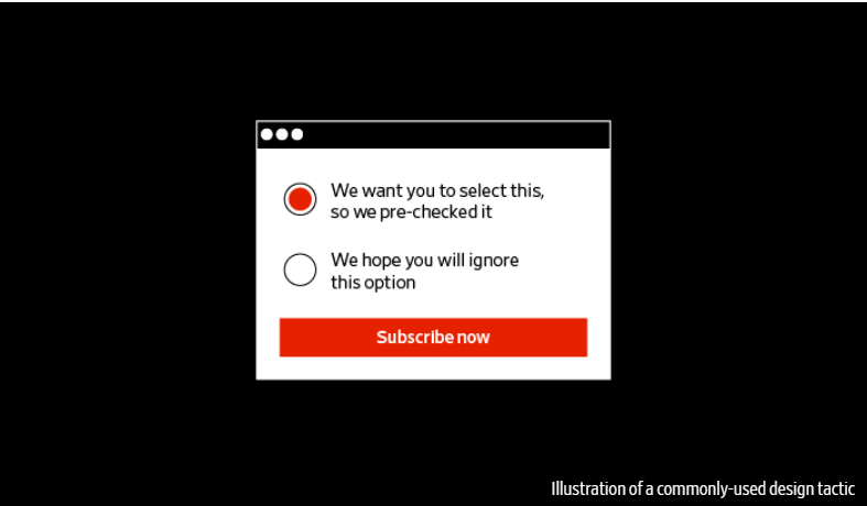
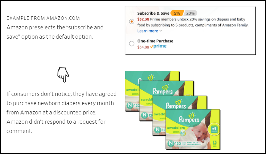
For example, making the “purchase” or “subscribe” button more brightly colored and enticing than the opt-out button is a dark pattern, but it’s a pretty harmless one that won’t alienate most shoppers. I don’t think you can judge this dark pattern as harshly as one that automatically opts you in without giving a clear choice. The wide variety of dark patterns leaves a lot of gray areas.
As a consumer, I draw the line at dark patterns that take something valuable from me, such as my money or personal information. I don’t particularly mind a pop-up that makes opting into the email newsletter look more enticing than opting out. But when the dark pattern tricks me into making a payment or sharing my email contact list, I’m no longer okay with it.
In short, consumers do expect some manipulation from brands, but some dark patterns take it way too far. That said, brands might ultimately benefit from moving away from dark patterns altogether, even if they aren’t extreme. Short-term conversion rate success may not be worth fostering long-term customer distrust. Mark Schaefer’s book Marketing Rebellion makes an excellent case for adopting tactics that put customer happiness before conversion rates (read our full review here).
As brands seek new ways to navigate a saturated landscape, avoiding dark patterns can help them stand out. And as privacy laws get tighter, the risks of using dark patterns will only grow, which should push brands toward more honest tactics. But “light” dark patterns, like using color and word choice to drive a decision, will probably still prevail - and ultimately, I don’t think they are that harmful. It’s the more extreme examples that pose serious problems for customers and companies alike.

Jun 25, 2019 - 09:26 AM
Online retailers seem to keep pushing the boundaries between persuasion and fraud. And now there is even proposed legislation to make "dark patterns" illegal according to this New York Times article.
The Times article is reporting on a recent Princeton University study titled: Dark Patterns at Scale. Findings from Crawling 11,000 Websites.
It cites techniques like the ones below that I think should be punished by the FTC.

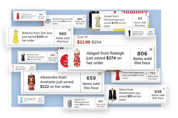
When potential customers visit the online resale store ThredUp, messages on the screen regularly tell them just how much other users of the site are saving. “Alexandra from Anaheim just saved $222 on her order” says one message next to an image of a bright, multicolored dress. It’s a common technique on shopping websites, intended to capitalize on people’s desire to fit in with others and to create a “fear of missing out.” But “Alexandra from Anaheim” did not buy the dress. She does not exist. Instead, the website’s code pulled combinations from a preprogrammed list of names, locations and items and presented them as actual recent purchases.
But it is going to be hard to pass, let alone enforce, the article adds:
“The important question as a policy matter is what separates a dark pattern from good old-fashioned advertising,” he said. “It’s a notoriously difficult line to find — what’s permissible persuasion vs wrongful manipulation.”Another dark pattern technique is "confirmshaming" described below. While scammy, it is hard to see how the law could make this illegal:
“The important question as a policy matter is what separates a dark pattern from good old-fashioned advertising,” he said. “It’s a notoriously difficult line to find — what’s permissible persuasion vs wrongful manipulation.”


Add New Comment