Answers

Jun 19, 2019 - 08:36 AM
The strategies that will work best depend on your specific site and audience, so you may need to test a few different methods to find what gets results.
A/B testing is one good way to narrow down the best email capture methods for your site. You can also use a “heat map” test to track mouse movement and clicks, which will show you the best potential areas of your site to place an email capture option.
These strategies will give you some ideas for what to test, and help you get the most out of whichever method you ultimately choose.
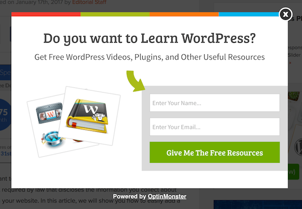
What will people get out of signing up for your email list? Show them how you’ll provide value right away, and they’ll be more likely to provide an email.
Instead of text like, “Let’s stay in touch! Sign up for our newsletter,” try offering a discount or exclusive information in exchange for the signup. Then, make sure to actually deliver on that value. Send a discount code that works or an exclusive, useful how-to right away. Giving away something valuable instills the sense that you care about your customers and won’t just use their email to make pitch after pitch.
Change Your Pop-Up Timing
If you use pop-ups, simply changing the timing of when they appear can make a huge difference in your results. Here are a few ideas for when to have your pop-ups show up.
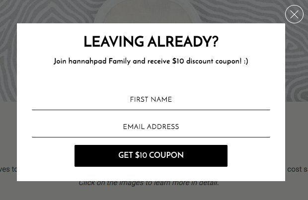
Exit Intent
Requesting an email when someone first visits your site can seem too pushy (especially when you get a lot of search traffic). The user hasn’t had a chance to view any of your content yet, so how would they know whether they want to sign up for your emails? It’s often better to wait until they’re about to leave.
And even if entry pop-ups turn out to work well for your site, you can still boost your results with an exit intent pop-up. Since they’re already leaving your site, you have nothing to lose, so give your absolute best offer here.
Bottom of Content
You can also have your pop-up appear at the end of a post, after people have had a chance to read through. If they’ve read all the way to the bottom, chances are good they’ll want to sign up for more.
This is especially valuable in your blog section. An entry pop-up might make sense elsewhere on your site (such as offering a discount to shoppers visiting your ecommerce page). But move that pop-up to the bottom of the page for your blog section, so it won’t interrupt people who are trying to read.
Linked to Your Content
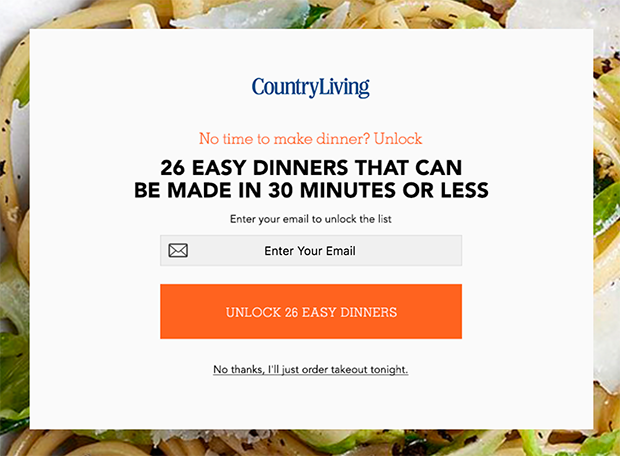
Another great way to pair email capture with blog content is to use a pop-up (or other email capture method) that upgrades the content value.
For example, maybe your clothing ecommerce site has blog focused on fashion. After users read it, you could offer a free download of your “100 Ways to Shop Your Closet” e-book as a reward for an email signup. This works by offering someone more content that goes above and beyond what they were just reading.
After Second Pageview
People may also be more receptive to pop-ups when they show up on the second pageview rather than the first. Allow them to read through the information they wanted on the first page. Then, when they navigate to a second page, or come back to your site later, the pop-up doesn’t seem so aggressive.
Customize Based on Interest
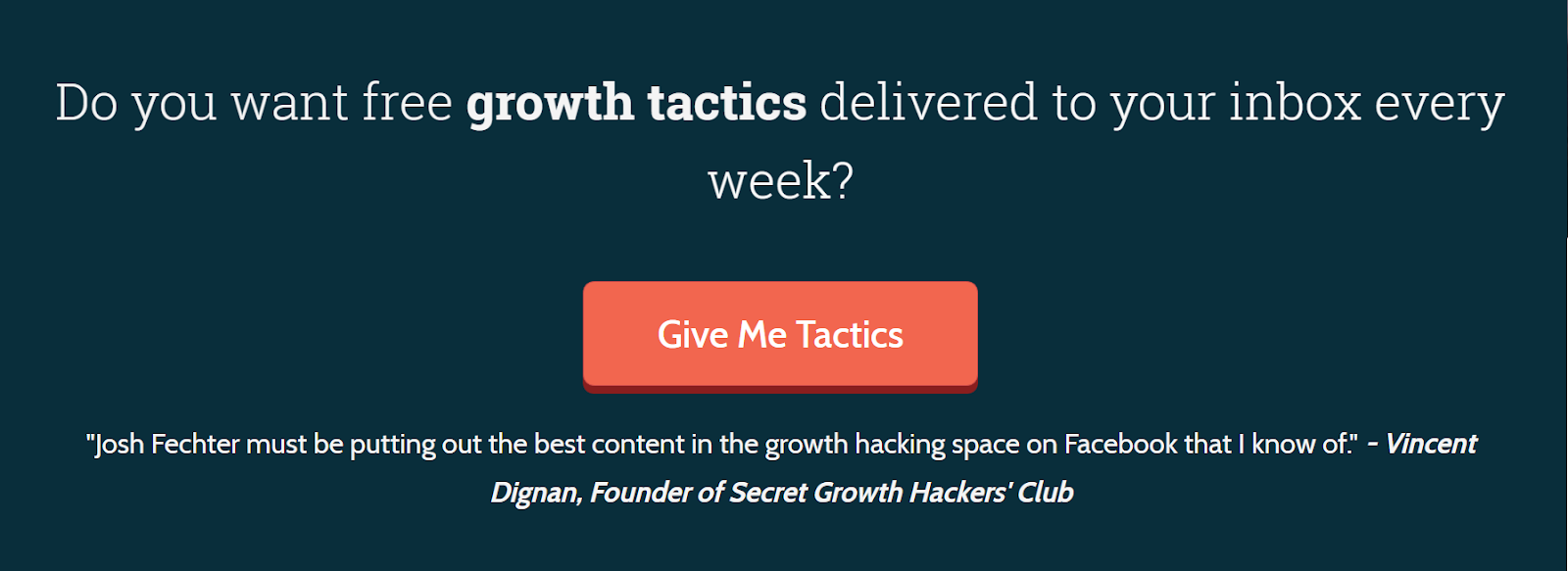
In addition to changing the timing of your pop-ups, you can also change the text. Try customizing the offer based on the pages a user was viewing. Use specific content offers that target their interests. For example, the user who was reading your marketing services page might get an offer of a PDF download about new social media strategies.
Try a Slide-in
A well-placed pop-up often gets great results. But for some users, pop-ups are still too pushy. Unlike a pop-up, a slide-in takes up just a small portion of their screen, so it doesn’t seem as intrusive.
Set it to appear after the user has scrolled partway down the page, providing a gentle nudge at the right time.
Make It Static
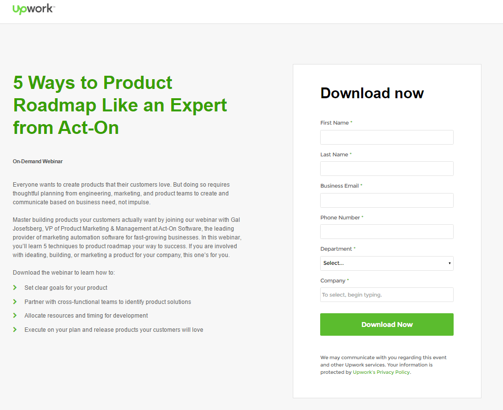
You might also want to use a static email capture tool, rather than a pop-up or slide-in. Static captures work well as long as they’re paired with an appealing offer and eye-catching visual design. A heat map test can show you the best place to put it, but here are a few choices:
End of content: Place a subscribe box at the end of a blog post.
Inline: Inline capture ads appear within your content without disrupting the reading process.
Landing page: Make email capture the focal point of a landing page.
Sidebar: Another unobtrusive way to get good results.
Sticky top bar: A top bar that stays in place as a user scrolls.
Homepage: Your homepage gets lots of traffic, so why not put an email capture box at the top?

One more way to get results: make the user initiate the capture process.
When we start a task but don’t finish it, thoughts of the unfinished work tend to bug us until we go back and complete it. In psychology, it’s called the Zeigarnik Effect. In marketing, it can help you capture more emails.
Try turning your email capture method into a (short) process that users must initiate. First, create a link that entices them to click with an exclusive offer (such as “Want 20% off your next order? Get it here”). Then, have your email opt-in form pop up, or take them to a dedicated landing page. If they navigate away without completing the capture form, it will likely stick in their mind until they go back and do it.
Capturing emails would be easy if there was a one-size-fits-all solution. But instead, you have to know what your users are most likely to respond to, and design your method based on that. Pick a few ideas from this list that seem like a good fit, test them out, and then refine your approach until you get the results you want.

Jun 19, 2019 - 09:02 AM
OptinMonster also has an exhaustive post on some of the things you can do to increase email optins:
https://optinmonster.com/18-ways-increasing-conversions-throughout-your-sales-f
unnel/
While it is written to promote their product and all its nifty features there are surprisingly good tips and real world case studies.
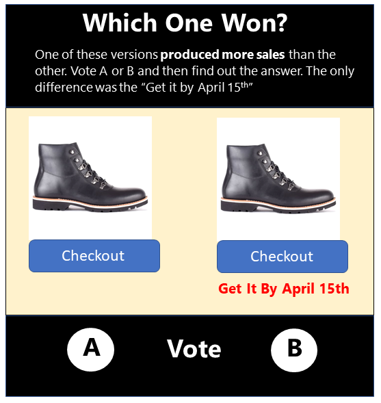
But if you only take away one thing from the article is that you should test different approaches and different lead magnets. Sometimes, even a slight difference in wording can make a huge difference. And once you have something that performs acceptably, split-test the hell out of



Add New Comment