How We Got 75% More Ecommerce Orders In a Single A/B Test for This Major Brand
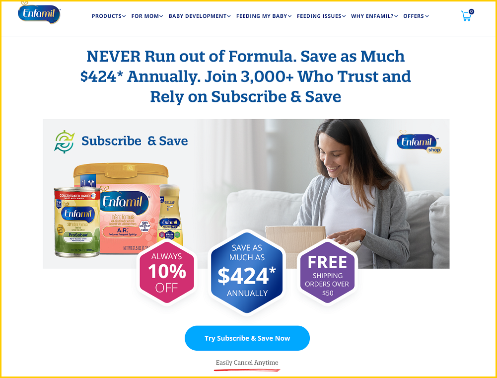
The screenshot above is from the winning, optimized treatment (above the fold)

The original page (above the fold)
Summary
-
The Conversion Wizards is the consulting arm of Capital & Growth and specializes in CRO (Conversion Rate Optimization) tasked with increasing conversion rates for a multi-billion dollar brand.
-
We designed a research-driven page and ran an A/B test where the winning design produced 75% more orders on the company's Subscribe & Save page. The result attained 99% statistical significance.
- Click here to get six more case studies
Google Optimize Screenshots


Notes
-
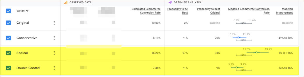
The version labelled “radical” is the winning version that produced the 75% sales lift. The original and double-control are the exact same page. We always insert a double-control as a sanity check.
-
To calculate the lift, we used an average of the two identical pages as the baseline, yielding: 75% lift at 99% statistical significance
The Original Page (full)
[Click on Link to see full image]
The Winning Treatment (full)
[Click on Link to see full image]
The Research that Informed the Winning Design
Before I discuss the changes made, I’ll briefly mention the research that informed the design of the new page. This is an important point because too many CRO practitioners do not spend enough time trying to understand the specific reasons why more site visitors are not converting.
We surveyed bouncing visitors and also happy customers of the Subscribe & Save program. For the bouncing visitors, one of the key questions we asked was: If you did not purchase today, what was your reason. Below are the results:
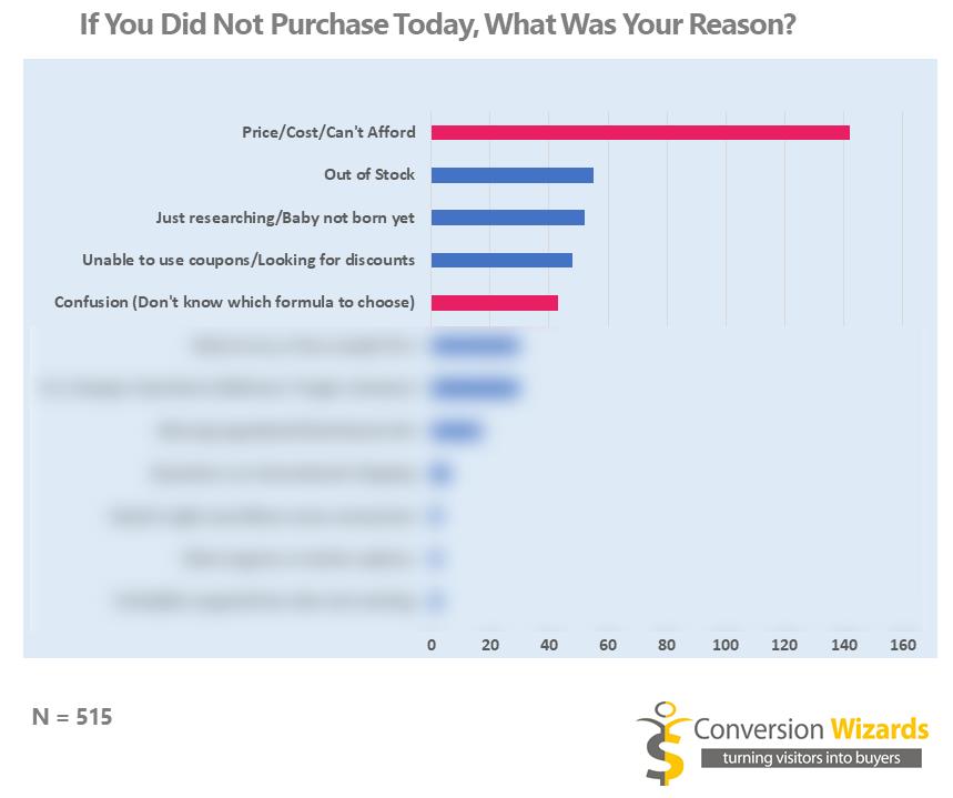
Of the top reasons cited for not buying the two we decided we could most easily affect (indicated by the red/violet bars) were:
a) Too expensive/cannot afford/price
b) Confusion. Don’t know which formula to choose.
Below is the corresponding word cloud that shows how big an objection price is:

How To Design a Higher Converting Page
To design a page with a high probability of producing a sales lift, you need to answer two basic questions:
1. For the website visitors who bought, why did they buy? (their reasons, in their words). You will often be surprised to find out that customers bought your product for a reason different from what you intended--after all, Thomas Edison expected that his phonograph player would be used for recording wills! Clayton Christensen’s milkshake story is also instructive.
2. And for those who didn't buy (the vast majority), why did they not buy?
Once you have a good understanding of the answers to these two questions, create a page that:
-
Amplifies the appeal factors (the answers to question 1). Put another way, articulate your value proposition in a more compelling way.
-
Handles the expressed objections (the answers to question 2) much like a skilled salesperson would. In his best-selling book The Catalyst, Jonah Berger explains that this is the real secret to persuasion. While it may sound simplistic, you’ll be surprised how many CRO practitioners start with fancy AI and machine learning!
Two Main Goals: Address Price Objection and Reduce Confusion
Based on the research above, the winning treatment had two main goals: Address the price objection (by strengthening the value proposition) and reduce confusion. We used the following tactics:
-
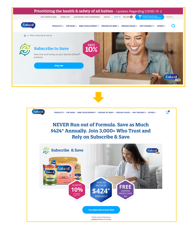
A headline that conveys a specific benefit (and allays a concern) cited by customers: When we surveyed customers of the Subscribe & Save program the phrase “never run out of formula” came up a lot, and so we used it in the headline--the most important element of a landing page. Examples of ways the phrase was used include “I never want to run out of formula again”,“I ran out of formula and had to drive to Walmart at midnight”
-
A large dollar value to quantify the savings possible: 10% off is nice but “save as much $424 annually” is better and more concrete!
-
Articulated --and enumerated--the benefits in a more compelling way:

The image above shows a more compelling way to present the benefits

While this one from the original version shows what might be considered table stakes. Customers expect you to have all these things (adjust your schedule, add or remove products, update billing & shipping information)
-
Used a call-to-action that implies less commitment: (“Try Subscribe & Save Now”) and beneath each one added the reassurance “Easily Cancel Anytime”. The most frequently asked question was “can I cancel?”. You see, In this day and age where everything is a subscription box and “forever billing” schemes are rife, it is a major concern!

-
Reduced friction and confusion by simplifying the product selection process:
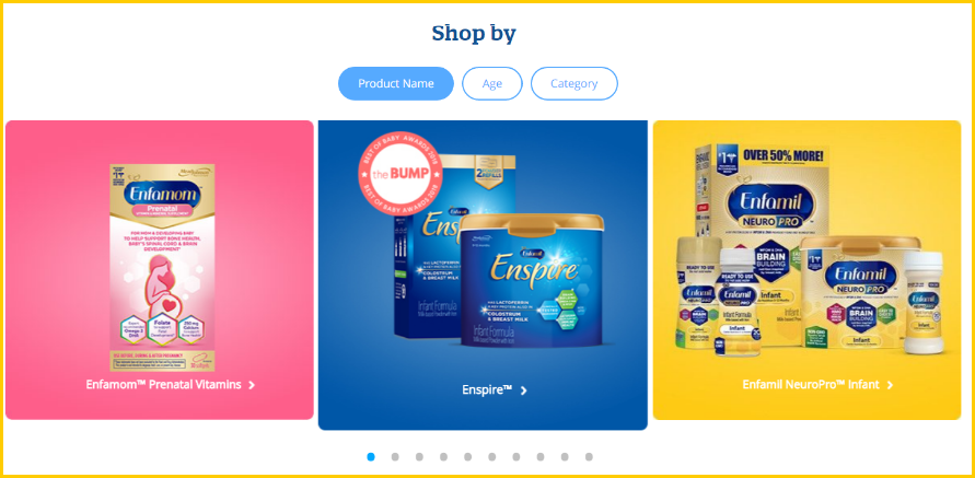
The image above shows how we reduced confusion and choice overload with appropriate higher-level categorizations

In the original version (above), upon clicking “Shop Now”, the site visitor is exposed to 39 products in a 3 x 13 grid, many looking rather similar. “Spot the difference” may be a fun game to play when you are bored, but is deadly when trying to sell!
-
Collapsed the Frequently Asked Questions to reduce information overload--and the resulting friction caused by unnecessary page length.

-
Added various forms of social proof: 500k+ likes on the Facebook page, 3,000+ customers for the subscription program, and testimonials.
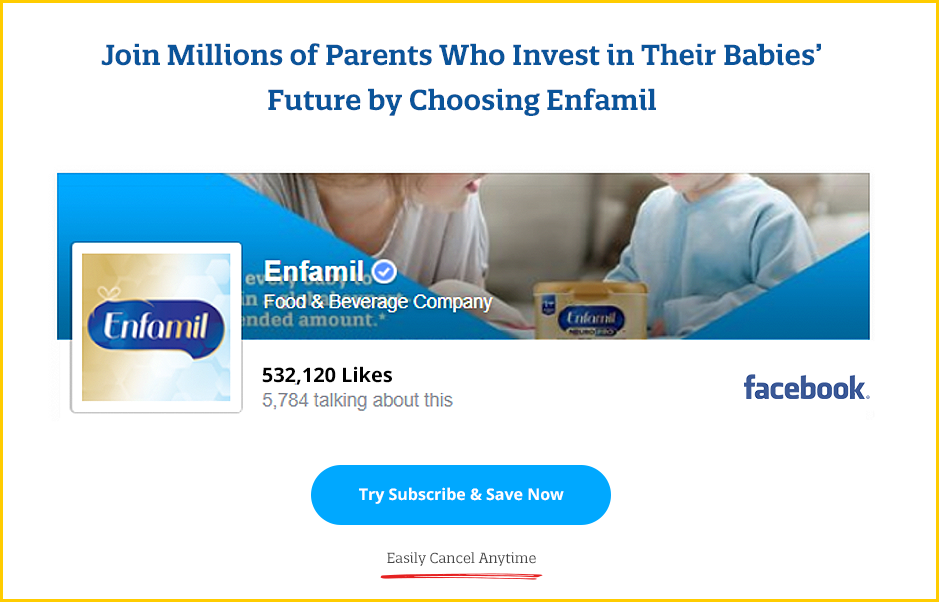
Social proof: 500k Facebook likes
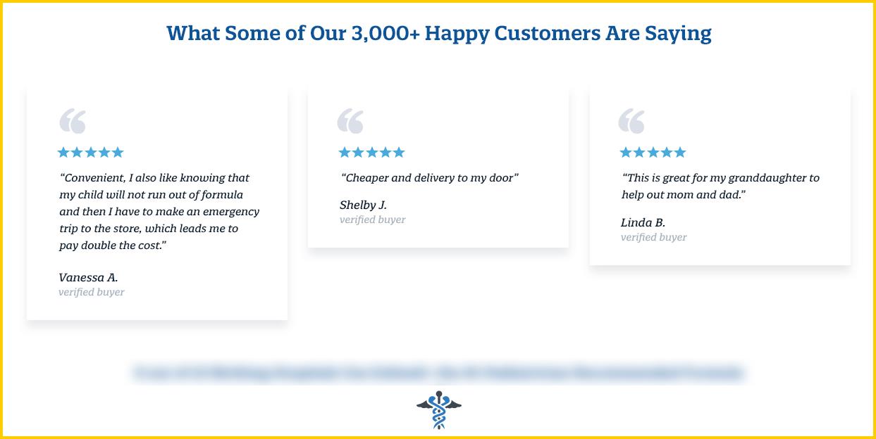
Social Proof: 3,000 happy customers, testimonials.
-
Included a low price and happiness guarantee: The survey responses revealed that some people thought the product would be cheaper at Walmart or on Amazon.

-
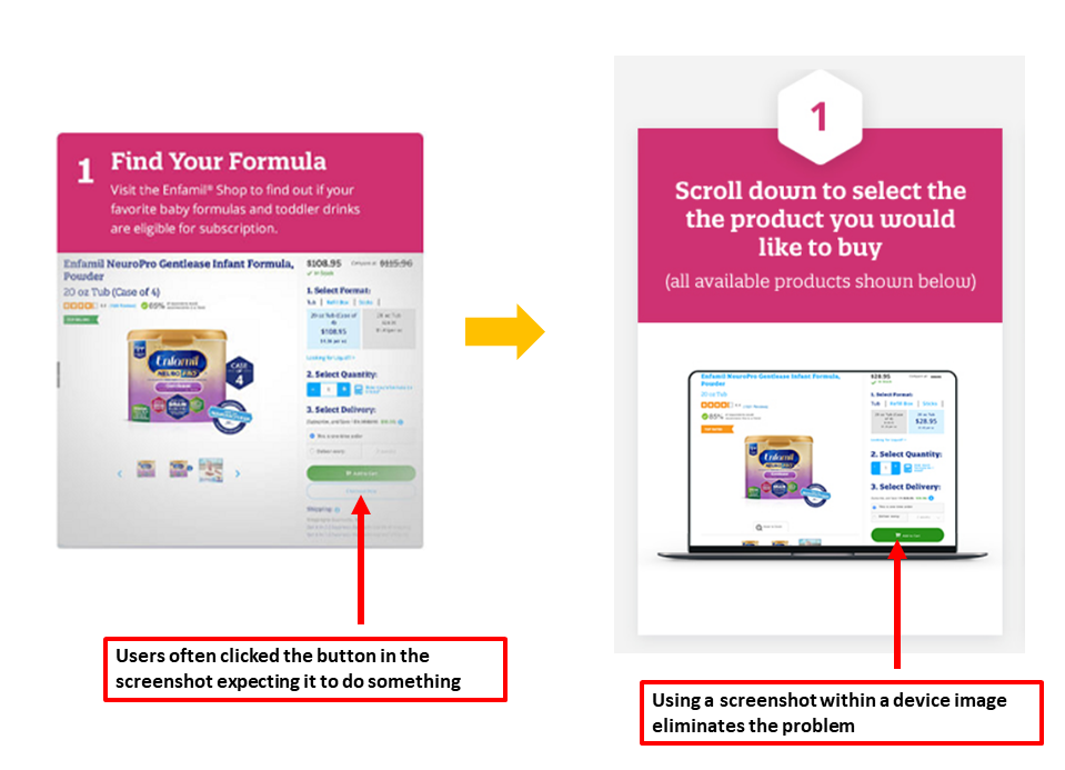
Reduced the confusion and “click rage” caused by the original screenshots: Heatmaps and video recordings showed that visitors were clicking on them expecting to transact. By using a screenshot within a device (on the right, below), no one is clicking anymore.
Final Thoughts: Favor Radical Redesign
While we don’t know how much each specific element contributed in increasing sales (or if some changes hurt conversion), overall the winning treatment performed 75% better.
Radical redesigns that involve a large cluster of variables (versus single element tests) have a higher probability of delivering outsize gains. The other advantage to this approach is you don’t need a lot of traffic to detect the gains and attain statistical significance. Microsoft recently published a paper that corroborates this.
Click Here to Get 6 More Case Studies and the Proven Process We’ve Used to Grow Dozens of Ecommerce Brands