How This $1.3 Billion Brand Could Get at Least 10% More Revenue

The RealReal, a former unicorn, is a marketplace for used luxury goods that went public in 2019 and is currently valued at $650 million based on an $8 per share price—down from $1.3 billion a few months ago. Its historical share price and revenue growth suggest a fair market value of about $1.6 billion. Luxury goods sellers usually suffer dramatic revenue hits during downturns, and we believe TheRealReal will eventually recover.
In this post we propose CRO (Conversion Rate Optimization) changes to their website that we estimate could increase its revenue from their website [0] (especially new visitors) by at least 30% and add $425 million to the company’s valuation. Conversion Rate Optimization is the art and science of increasing the percentage of site visitors who take the desired action, whether a purchase, email opt-in or app download.
FULL DISCLOSURE: We approached the company with these suggestions (hoping to get them as a client for our Conversion Wizards consultancy) but did not hear back. We are therefore using the analysis to educate our Capital & Growth audience--mostly small and mid-size ecommerce merchants. If you are a smaller ecommerce merchant, using the tactics and principles can help you generate more sales.
The RealReal’s $80 million revenue for the most recent quarter, implies an annual revenue of $320 million and a revenue multiple of 5x (not uncommon for fast growing marketplaces) [1]. The 30% more revenue estimate is based on specific changes we have seen work for similar other companies.
The company is not profitable and lost $52 million last year. These proposed changes could help get them closer to profitability and better weather the corona-caused downturn.
For brevity, we will only review two pages: the email capture and checkout pages, but there are other opportunities elsewhere on the site.
The Email Capture Page (Squeeze Page)
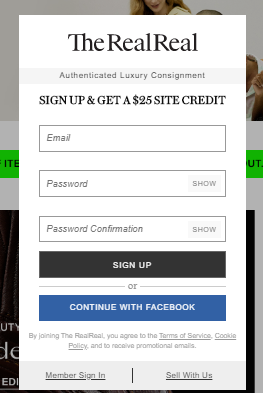
First, it cannot be minimized. You are forced to opt-in to browse the site. This type of high-handed lording it over users—the darkest of dark patterns—is diminishing the brand’s prestige. It is the antithesis of luxury! As CRO practitioners we are sometimes accused of using tactics that increase conversion but hurt the brand. On this issue we would side with the brand team.
Imagine walking into a Cartier or Prada store and being accosted by two shop assistants who grab your hands, force a pen into your palm, and make you write your home address (so they can mail you offers) before you can look at the merchandise! The RealReal’s form is the online equivalent of this brutish behavior 😊
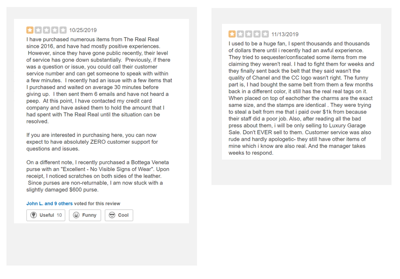
They are not doing themselves any favors given the highly negative customer sentiment:
With that out of the way, below is an optimized mockup of the form along with notes:

1. We give the visitor control. You can cancel the pop-up and browse the site if you are not quite ready to sign up.
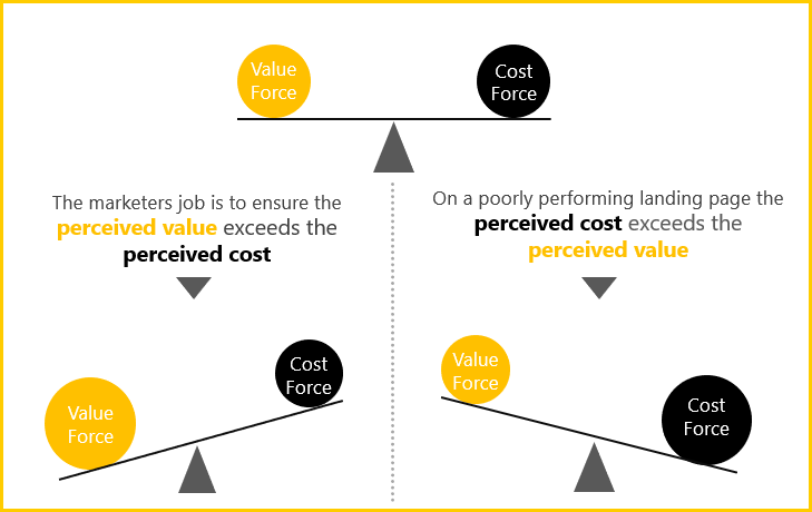
2. Use better headline: The $25 credit is more prominent, and uses a technique known as "point sequenced grammar" to first promise what you get (perceived value) before what you need to do (perceived cost). No one wants to "sign up" but most want a $25 credit. This tips the scale in favor of perceived value. When doing CRO, it is always helpful to have the scale below in mind.
3. Placed the logo at the bottom, with the primary benefit at the top (in the headline), the opposite of what the original does.
4. The form has a singular purpose and only one call-to-action: Capture the email of new visitors. Since it is cancelable, the other options can be moved to the main site. Having just one call to action (versus the four on the original) should increase the conversion rate.
5. Entice visitors with a visual: Show the kind of luxury goods they can buy on the site. This increases the perceived value of the $25 credit.
6. Uses a "process level" value proposition [1]: Replaced "sign up" with "Claim Your Credit Now". While the $25 credit is the “core” value proposition, each intermediate step needs to be sold as well. This is especially true for a multi-step funnel.
7. Lazy loading reduces friction: Only show the email field by default. The user can set a password upon entering their email.
8. The privacy seal and messaging reduce anxiety.
The lifetime value of a single email for a site like The RealReal is usually very high and so even a persistent 10% lift can be worth tens millions of dollars—you can send lots of promotions and only need a low take rate because the order value is much higher than in other ecommerce verticals. I’d bet this new design will get a 30% -- 100% lift based on our past work on email opt-in forms.
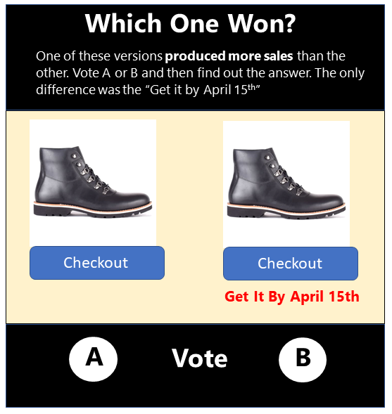
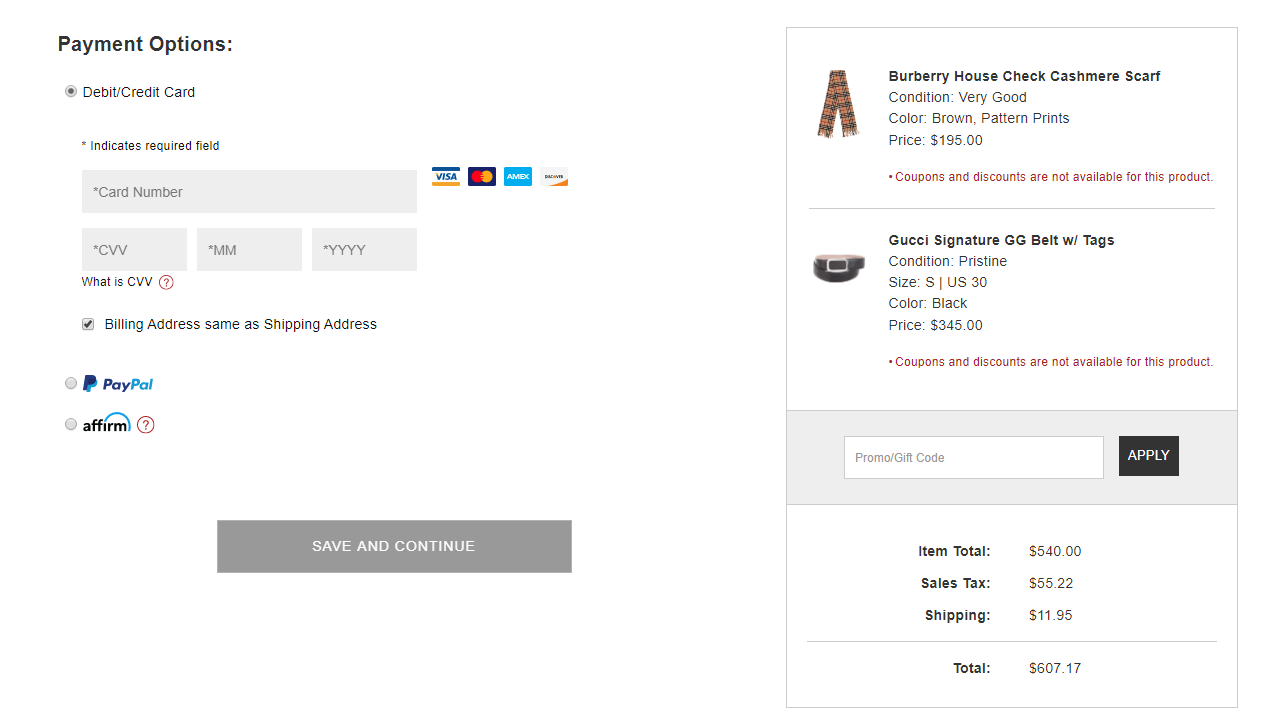
The Checkout Page
Here is their current checkout page.
Below is our optimized mockup:
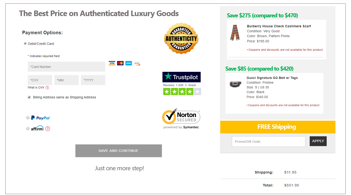
Similar changes to the ones in this optimized version led to a 56% revenue lift for a company in their space i.e. luxury goods with a high average order value ($300 to $5000+) [x]
Below we explain the important changes:
-
Added “anxiety reducers” , namely the Norton security seal and the Trust Pilot rating. These reassure the potential customer. Cart abandonment is a big problem in ecommerce and anxiety is one of the main reasons. For a luxury goods seller it is even more pronounced as the items are of high value.
-
Reinforced the core value proposition on the checkout page (“The Best Price on Authenticated Luxury Goods”). Even though visitors likely saw it on the main site, time and again, we’ve seen this lead to more sales.
-
Specify the dollar value of the savings realized. As we CRO practitioners like to say, specificity sells! Showing concretely how large the discount is (versus buying the same item new) should increase the conversion rate. And when done at the point of purchase (on the checkout page), the effect can be pronounced!
-
Use a seal to communicate visually that the goods are 100% authentic. This is still likely to be the biggest concern potential customers have. Using a seal, versus just stating it in text, makes it appear more official and authoritative--and is therefore more persuasive.
-
Prominent placement of “free shipping”. Mark up the price of the goods by the cost of shipping and then offer “free shipping”. I am almost certain this will produce free money for The RealReal. We’ve known this from our testing and Jonah Berger corroborates it in his new book The Catalyst: How To Change Anyone’s Mind.
“A free shipping offer that saves $5.99, for example, is more appealing to many customers than a discount that cuts the item’s price by $10, because the real barrier isn’t money; it’s uncertainty: Will I like the shoes? Will they even fit? Dropping the price by $10 helps on the money front, but it doesn’t reduce the uncertainty. The product is cheaper, but it doesn’t provide any better sense of whether I’ll like the shoes or whether they’ll fit. And having to pay to get the opportunity to resolve that uncertainty only makes people less likely to act. They might as well hit pause and do nothing instead.”
Final Thoughts
These proposed changes would likely increase revenue and help The RealReal get closer to profitability. The beauty of doing CRO is that it leads to more revenue WITHOUT incurring additional traffic/media costs—and so profit increases disproportionately. This then allows you to afford more expensive traffic sources, begetting yet more revenue. It is the closest thing to magic in business!
Jasper Kuria is the Managing Partner of The Conversion Wizards, a consultancy that specializes in CRO (Conversion Rate Optimization). In addition to large brands (Enfamil, Trupanion) and venture-backed startups, they work with private equity firms to help grow portfolio companies, and are currently the CRO vendor of record to Vista Equity Partners and HIG Capital.
Endnotes:
[0] They likely get a decent portion of their revenue from their app, which is better designed.
[1] Two-sided marketplaces like The RealReal tend to have a higher revenue multiple because they are harder to build than a regular online retailer—solving the classic “chicken-egg” problem is non-trivial and those who do reap the rewards.
[2] As always, you need to test, but based on recent learnings this type of forced opt-in isn’t performing nearly as well as it once did. On our own site, for example, we have a popup email capture form, which you likely saw. Even though it is prominent and has only one field, it performs worse than the barely visible registration button on the navigation bar. A higher percentage of visitors who first consume our content and appreciate its quality, endure the higher-friction process to join the community!
[3] Terminology coined by MECLABS
[x] Since publishing this, a commenter on Hacker News wrote:
This isn’t 2005. The only websites that use the “Norton security seal” and the “5-star Trustpilot rating” are scam websites. The “guaranteed authenticity” seal makes things worse.
I agree that users shouldn’t be forced to sign up to browse the website, but other than that, it seems the advice this article gives is to scream YOU ARE SAVING MONEY!!1 This is a luxury brand. All of the proposed changes makes the brand seem low-quality.
My response:
In CRO we always take the approach that no one knows anything and test everything. But we usually start with what has demonstrably worked, as proven by statistically significant tests. The Trust Pilot is their actual rating, which is favorable. Why not show it? It is likely to sway new users. Do consumers check review sites before buying? If they didn't all the review sites would not be thriving.
Yes, it is a luxury brand but their promise is luxury for a steal. That is the premise of the site. Why not reinforce it at the point of purchase? For me this would be worth testing.
As for the Norton Seal, original research in 2016 shows that:
"Females were significantly more likely to trust the Norton security seal"
"35.6% of participants voted for Norton’s antivirus seal."
"Participants showed no preference between trust seals and SSL seals but did show a preference for antivirus companies (possibly due to their familiarity with them)."
source: https://cxl.com/research-study/trust-...